Along with ‘colour drenching’ and other design terms slipped into our lexicon, ‘layering pattern’ can sound a little alarming, as though you’re about to slap every fabric you own into a room and create motif mayhem. Fear not. This is Part 3 of my Power of Pattern series. If you’ve followed along from the beginning, you’ll already know why pattern affects us emotionally and how to start small without overwhelm. This final piece is about what happens next: when you are confident that pattern really bring joy in your home, and you want to pull it together in a way that feels intentional rather than overdone.
Layering pattern isn’t about adding more for the sake of it. It’s about giving a room rhythm, depth and clarity, so it feels cohesive rather than busy.
Once you’ve lived with a few patterned elements – cushions, lampshades, rugs – you start to notice which types of pattern feel comfortable, and which don’t. At this stage, pattern stops feeling like a risk and hopefully starts feeling like a companion.
The aim of layering is not to add pattern everywhere for pattern’s sake, but to create a considered scheme in which the eye moves easily around the room, recognising familiar notes and gentle variations along the way. The result will be a room that reveals your personality, as quietly or loudly as you’d like.
Layering Is About Hierarchy
Successful pattern schemes rely on hierarchy. In almost every balanced room there is a clear lead pattern that anchors the space, one or two supporting patterns that echo or soften it, and quieter elements – often textural rather than motif-led – that allow the eye to rest. On the contrary, if everything competes for attention a room can feel unsettled; when each pattern has a role, the space reads as balanced, coherent and intentional.
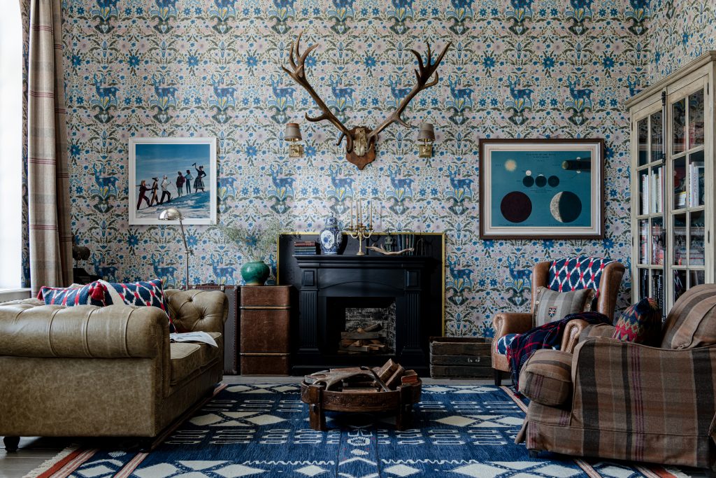
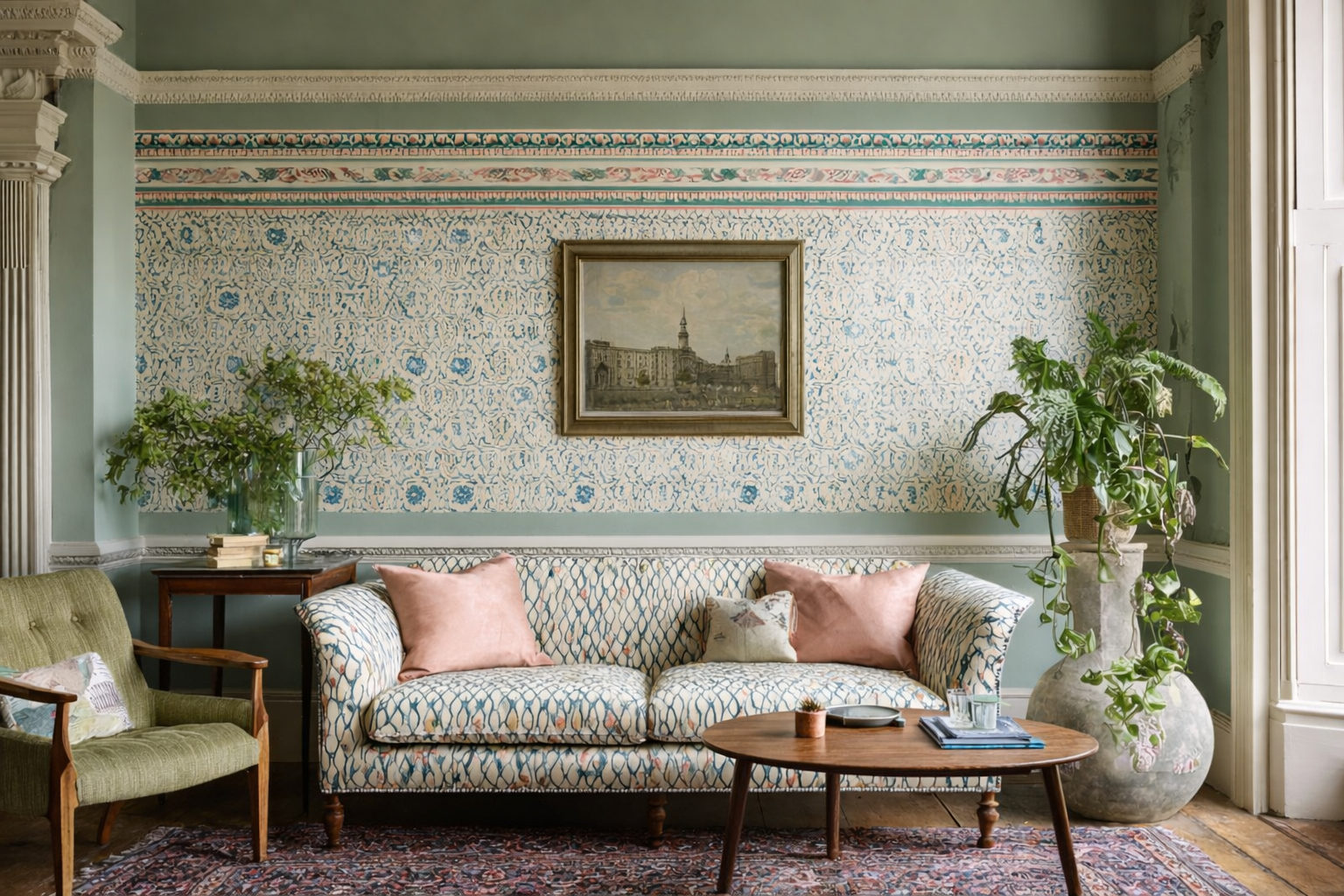
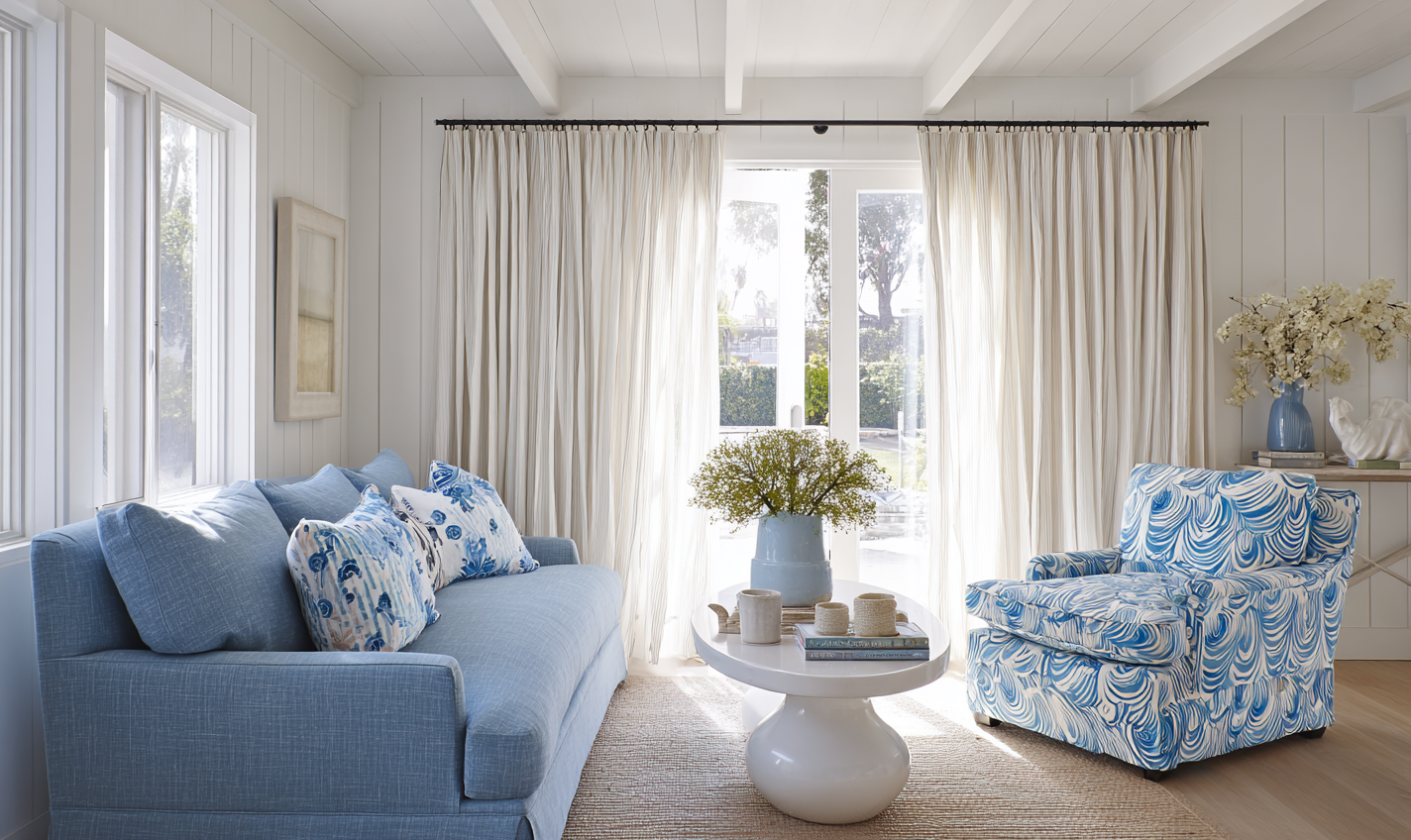
In this living room, the geometric rug draws the eye down from the striking Der Konig wallpaper by Mind the Gap, creating cohesion through colour that prevents either of them dominating. The muted brown leather and plaid textiles sit comfortably and feel familiar in this period room, creating moments of rest for the eye.
Choosing Your Anchor Pattern
Your anchor pattern is the element that carries the most visual weight in the scheme. This might be wallpaper, a large rug or patterned flooring, curtains or blinds, or larger upholstered pieces such as a headboard or sofa. Whichever form it takes, it should align closely with how you want the room to feel. Calm, classic and country spaces benefit from organic motifs, softer contrast and flowing repeats, while more energetic rooms can carry stronger geometric or larger motifs that provide a gentle drum beat of rhythm. However anchor patterns don’t need to be dramatic or bold: confident schemes can rely on relatively quiet patterns used generously on walls or window dressings for example.
Scale, Rhythm and Repetition
One of the most reliable ways to layer pattern successfully is to vary scale while repeating something familiar such as the type of pattern or colours within them. A scheme often works best when it includes a mix of large, medium and smaller-scale patterns, tied together by a shared colour, a repeated line direction, or a related motif. As I explained in the first post of the series, this gives the brain enough structure to feel settled – what environmental psychologists describe as legibility – while still offering interest, variation and a hint of mystery as the eye moves around the room.
Practical Pattern Combinations
Below are three practical combinations you can use as starting points. Each relies on hierarchy, shared colour, and varied scale.
1. Botanical Calm (Bedroom or Snug)
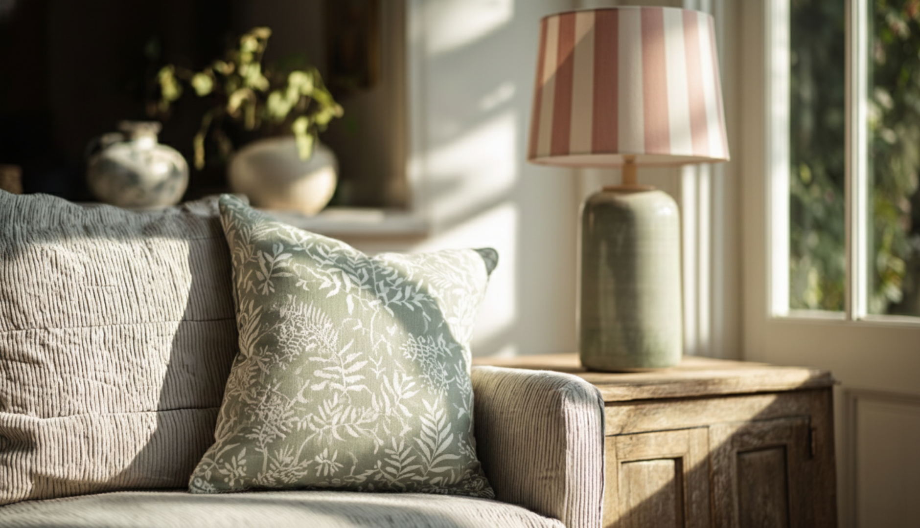
- Anchor: A soft botanical wallpaper with a flowing repeat, in muted greens or blue-greys
- Support: Linen cushions with a subtle stripe or ticking, picking up one tone from the wallpaper
- Quiet layer: Herringbone wool throw or textured headboard fabric in a complementary hue
Why it works: the organic wallpaper sets the mood, the stripe introduces order, and the textures keep the scheme restful.
2. Softly Ordered (Living Room)
- Anchor: A patterned rug with a medium-scale geometric design
- Support: Wallpaper with a wide plain stripe
- Quiet layer: Cushions combining a smaller geometric or check with plain velvet or wool ones
Why it works: the rug grounds the room, the cushions echo its structure at a smaller scale, and the striped walls offer a simple pattern that prevents visual overload.
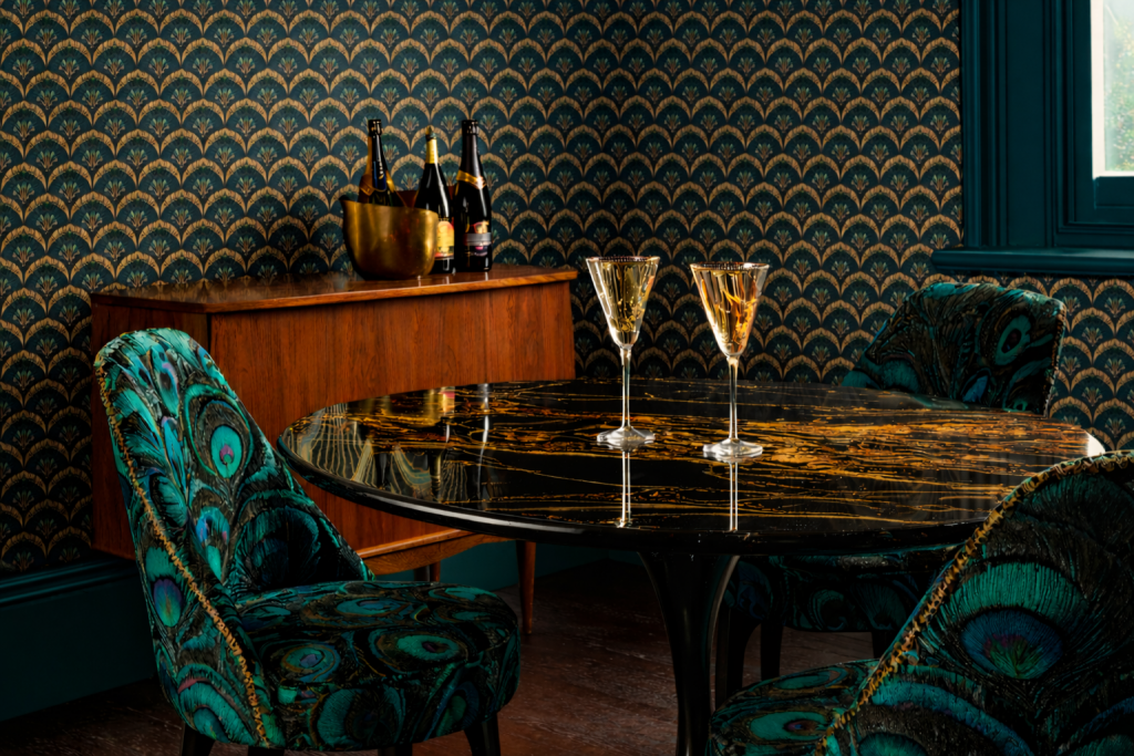
3. Decadently Distinct (Dining Room)
- Anchor: A dark and metallic mid-scale wallpaper pattern used across all walls
- Support: Upholstered dining chairs or bench cushions in a larger-scale or looser motif
- Quiet layer: A timber or marble table adding soft natural grain or veining
Why it works: the bold repeat pattern wallpaper sets the Art Deco tone, allowing equally bold accents to sit comfortably without dominating the space.
Pattern and Texture
Texture is often the softest layer of pattern that helps a room feel calm rather than busy. Natural textures especially help, since they are more ‘expected’ in our homes and provide relief and familiarity for the eye. Woven fabrics, timber grain, stone veining and soft pile textiles all introduce visual interest without demanding attention.
If a scheme feels close to being ‘too much’, adding or emphasising texture rather than another motif can bring it back to cohesion and calm, if calmness is the desired intention.
Common Layering Pitfalls
When pattern feels overwhelming, it does not always mean there is too much of it. More often, the issue is a lack of hierarchy, patterns that are too similar in scale, or an absence of quieter elements to balance the scheme.
Choosing patterns in isolation can also make them harder to bring together later. So if you’re furnishing and decorating a room, plan in advance where you want to include pattern, and only buy key elements – the wallpaper, curtains, rug or lampshades – once you’ve compared and considered them together.
A second common pitfall is choosing patterns without testing them at home. A fabric that feels gentle amongst the busy and bold samples in a fabric shop could still look quite dramatic in your calmer home. Always view samples in the actual space, at different times of day, and against the finishes they’ll sit beside. Consider how glimpses of them will look from other rooms – is there a common theme or colour that helps bind these?
Final Thoughts
Layering pattern is less about bravery and more about using this simple guidance – and your own instincts about why you love those particular choices.
When done well, pattern adds depth, warmth and personality, and that’s going to result in a room that brings you joy.
And if you’d prefer not to do all the heavy lifting yourself, this is exactly the stage where I often step in – helping clients bring clarity and cohesion to patterns they already love, so everything works together with ease. If that sounds helpful, contact me about my Power of Pattern consultations.
Pattern can be an enriching part of a home, adding movement, energy, softness or structure in a way that plain surfaces often can’t. But we each have our own preferences and tolerances for pattern. What feels uplifting for one person can feel overwhelming for another.
If you sense that something is missing in a room, that it feels a little flat or somehow ‘off,’ it may be because there’s no visual rhythm or anchor for the eye to land on. Pattern can often be the missing dimension. If you’re curious about introducing it into your home in a way that feels comfortable and natural, read on.
This is Part 2 of my Power of Pattern series. In Part 1, we explored the psychology behind pattern – why certain motifs calm us, why others energise or unsettle us, and how our brains respond emotionally before we’re consciously aware of it. Now that we understand why pattern affects us, we can begin to explore how to introduce it into our homes in a way that feels natural, personal and reassuring.
Pattern doesn’t need bravery. It needs understanding, and confidence begins with small, intentional steps.
Now That You Know the Why… Let’s Explore the How
This part of the series is all about learning to trust your instincts. If Part 1 helped you understand why pattern feels the way it does, Part 2 is about tuning into those instincts and using them to guide your early decisions. Rather than leaping into expanses of large-scale pattern straight away, we’ll start small, build confidence gently, and allow your personal preferences to surface at a comfortable pace.
How to Recognise the Patterns You’re Instinctively Drawn To
Trust me – everyone likes pattern. If you have a knee-jerk reaction to the suggestion of bringing pattern into your room it’s possible you are thinking of something busy, over-powering, possibly dated. So let’s start with understanding your personal pattern preferences.
As noted in Part 1, psychology and environmental design research, including in the Journal of Environmental Psychology, (Bower, Tucker & Enticott, 2019) shows that familiarity strongly shapes comfort.
Have a look at photos from childhood summers, from favourite holiday spots or ‘happy places’ closer to home, and flick through a magazine on a subject that interests you – nature, boats, cooking, travel etc. When you feel drawn to a particular image, study it – what about it feels specifically appealing, and what patterns, structure, order, or lack of, do you see? Let’s take an example – the picture below of a Ferrari.

The Ferrari SF90 Stradale – image courtesy of Alexandre Prevot, wikimedia
If your eye lingers on the fluid sweep of its silhouette or the sculpted rear curves, you’re likely drawn to softer, organic shapes and patterns. If, instead, you’re immediately pulled toward the sharp headlight slits or geometric air intakes, you may prefer cleaner lines and structured, graphic motifs. A focus on the radial stars of the wheels suggests a deep appreciation for rotational symmetry and mathematical order. It’s a simple way of noticing whether you naturally gravitate toward fluidity or precision – an instinct that often translates directly into the types of patterns you feel most at ease living with.
Now move onto pattern samples – you can do this online, browsing through wallpaper and fabric offerings on sites like Jane Clayton or Wallpaper Direct.
As you scroll through, notice your first, almost subconscious reactions. Do you lean in or pull back? Do your shoulders soften or tighten? Does your eye rest comfortably, or keep scanning for clarity?
These micro-responses often reveal more than rational analysis.
Then ask:
- Which patterns feel familiar or comforting?
- Which evoke curiosity or excitement?
- Which remind you of a place, memory or season in your life?
This gentle audit allows you to identify patterns that align with your emotional history – whether that’s the reliability of stripes, the calm of botanicals, the structure of geometrics, or the nostalgia of classic prints.
Let Colour Lead and Pattern Support
Once you know your pattern instincts, the next layer is understanding how pattern interacts with colour.
If your room already has a colour palette, pattern should work with it and complement it. Think of pattern as a way to:
- deepen a palette
- introduce movement
- soften contrast
- or bring a sense of coherence through repeated tones.
Some helpful approaches:
- Neutral rooms: Pattern introduces warmth, depth and personality through texture or subtle design.
- Colourful rooms: Choose patterns that repeat one of your main hues to maintain harmony.
- When unsure: Pick a pattern where the background tone matches your wall colour or largest upholstery piece.
This keeps things calm, intentional and grounded.
Before choosing which patterns to bring in, it also helps to ask how you want to feel in the room, and what the space is primarily used for. A bedroom designed for rest and recovery will benefit from gentler, more organic patterns with low contrast and softer movement. A living room where family gathers, talks, and plays may benefit from more energy – patterns with clearer rhythm, stronger structure or a touch of boldness can feel appropriate and uplifting. How you want the space to support you emotionally should guide whether the pattern you choose needs to soothe, inspire, or enliven.
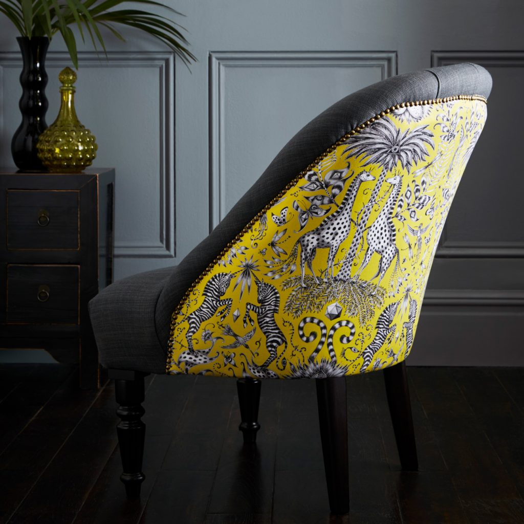
From the front this accent chair has a simple charcoal buttoned effect. The back however tells a bolder story with the opulent Kruger cotton satin in vibrant lime green. Soho Accent chair by Limelace.co.uk
Gentle Ways to Introduce Pattern Into Your Home
By now you hopefully have some ideas of the type and colour of pattern you think will work in your room. These have been great first steps. Time for the next one: start with small, low-risk patterned elements in your room that allow you to experiment and build your confidence.
Lampshades
A wonderfully safe place to begin. A patterned shade adds personality without dominating the room.
Cushions
Perfect for experimenting with scale and motif. Try one hero pattern paired with a quieter companion.
Tile decals or stickers
For kitchen or bathroom splash backs, self-adhesive tile stickers applied to your existing plain tiles allows you to see how pattern interacts with the other surfaces and finishes in these rooms. Well applied and good quality decals can last many years in a kitchen, so these aren’t necessarily a temporary fix ahead of expensive re-tiling.
Decorative Vases & Ceramics
Ideal for geometry or bolder motifs – a patterned vase on a sideboard or mantel gives the eye a point of interest.
Small Upholstered Pieces
A footstool, end of bed bench, or removable seat pad covers for a wooden armchair cushion let you explore textile pattern in a more substantial way, but still with flexibility. With a staple gun you can easily recover an existing footstool or bench with an inexpensive remnant of fabric – and just as easily remove it if it doesn’t make you smile.
Rugs
A bigger statement but still inexpensive and movable. Rugs are excellent for understanding how pattern scale impacts the perceived volume of a room.
Whichever of these you employ, note your reaction to them as you enter the room, or when you’re seated in a favourite spot and glance over. See how they feel during different times of the day, when perhaps that room is used for different purposes. Are you feeling a shot of joy, or a pang of apprehension. If it’s the latter, give it a few more days, or move the item around. And if it doesn’t feel right, try swapping it with a different pattern, a different scale, something with painterly brush strokes rather than sharp lines, or a different colourway.
In this calm dining area, Pooky’s Wobster rechargeable lamp, with Studio Killian-Dawson shade packs a small but joyful punch.
Why Small Steps Matter
These smaller pieces let you explore pattern at your own pace – noticing your emotional responses, adjusting scale, testing colours and building confidence as you go. They’re far less risky than patterned curtains, wallpaper or a patterned sofa, which carry more visual weight and a stronger presence.
For some people, these smaller touches are enough. For others, they spark a desire to go further, to let pattern become a defining feature of the room. If that’s you, we’ll delve into how to layer and scale pattern beautifully in Part 3 of this series.
A few gentle tips as you experiment:
- Consider inherent woven or other textile patterns such as herringbone or moiré.
- Bold textures such as bouclé or marble veining can scratch a pattern itch.
- Start with subtle contrasts before exploring bolder combinations.
- Trust your emotional signals.
Final Thoughts
Pattern doesn’t need to be dramatic to be meaningful. Begin with pieces that feel safe, notice what resonates, and let your confidence unfold naturally. Many beautiful schemes are complete with just these small patterned elements layered against plain walls, simple flooring and block-colour upholstery.
In the final part of this series, we’ll explore how to layer and scale pattern – from quiet weaves to expressive motifs – to create depth, harmony and interest.
What do you associate with someone who ‘loves pattern’? Do you think of them as eclectic? Bohemian? Extrovert? Laissez-faire? I expect there’s at least a small internal voice that says ‘ooh now, they are confident/a bit bonkers’ [delete as appropriate]. A glance through any interiors magazine will show that the calm, neutral decorative scheme is as popular as ever. We don’t see many showcases of rooms or homes that could be described as a ‘riot of pattern’. If we do they often contain the word ‘brave’!
But not everyone wants to live in a neutral showroom. Quite a lot of us would say we like, even love pattern – but we’re still hesitant about using lots of it in our homes. And I think that’s perfectly understandable – because pattern, far more so than colour, displays – or betrays – our personality. And adding personality to a home is still, sadly, seen as risky. Both from a resale perspective (how sad) and a ‘tell me I’m not about to ruin my home?’ concern.
This is the start of a 3 part Pattern blog series – in which my aim is to help build your understanding of, and then confidence, with pattern choices.
Building Confidence Through Understanding
Pattern isn’t simply about decoration; it’s about how our eyes and brains make sense of the world around us. When we recognise why certain patterns comfort us while others feel unsettling, we can start to use them with intention rather than hesitation. The most confident decorators aren’t brave; they’re attuned to how design interacts with emotion.
Some of you may be aware of Colour Theory – perhaps you recall seeing a wheel of the primary and secondary colours (if you’d like a reminder, here’s my blog post on exactly this subject!) But how many of us know anything about Pattern Theory? I’d say very few. Probably because it’s not really an area that has received much scientific attention. Neither has Pattern Psychology – whereas there is a decent body of work on how colour influences our mental wellbeing. I believe we can build our confidence with pattern in interiors when we understand our emotional and psychological connection to it. Meanwhile a few pattern rules and theory can help guide our decisions. So – let’s get a bit scientific.
Why the Eye Needs Somewhere to Land
Why does an absence or over-abundance of pattern affect us? Environmental psychologists Rachel and Stephen Kaplan found that people feel most comfortable in spaces which balance two key qualities: coherence & legibility versus complexity & mystery. Coherence gives us order – we need to make sense of what we’re seeing, to be able to read it confidently and easily so that we can assess our safety level. Complexity offers richness, and mystery promises the alluring enticement of discovery. Rooms that combine these traits feel both calming and engaging. Conversely, those that lack pattern can feel flat and lifeless and those that contain lots of pattern risk us feeling confused and disorientated. As the Kaplans put it, “humans seek environments that are both understandable and involving” (Environmental Preference: A Comparison of Four Domains of Predictors, 1989).
Pattern often provides exactly that sweet spot. A repeat, or recurring motif, creates recognisable structure – the coherence – while its placement, variation and rhythm supply complexity and a touch of mystery. When a room has no visual pattern or anchor, the eye continues to search for organisation and reward, and the space can feel uncomfortably sterile. Cognitive scientists describe this process as processing fluency: our brains experience pleasure when an image is easy to interpret but not completely predictable (Reber, Schwarz & Winkielman, Processing Fluency and Aesthetic Pleasure: Is Beauty in the Perceiver’s Processing Experience?, 2004). In interiors terms, that means a well-placed patterned element – a tiled hearth, a fabric headboard, or a decorative rug – gives the eye somewhere satisfying to land. It’s not decoration for its own sake; it’s how our visual system finds balance between calm and stimulation, between knowing and wondering.

Patterns in nature – often shaped by the Fibonacci sequence or Golden Ratio – can be mesmerising and soothing.
Patterns in Nature: Our Biophilic Connection
We are instinctively drawn to natural patterns – from the branching of trees and veins of leaves to the spirals of shells and the ripples of water. Research into biophilic design and the neuropsychology of space confirms this response: organic patterns capture our attention without overwhelming us, evoking feelings of fascination and calm. And nature can create some spectacular patterns. Consider the snowflake – a masterclass in symmetry and fractals. Fractals repeat at smaller and smaller scales, offering visual richness that our brains find both engaging and soothing. As noted in the 2024 Neuropsychology of Space report by the American Society of Interior Designers, “Spaces that include fractal patterns, whether in architectural details or decor, invite closer inspection and promote a sense of relaxation and attentiveness.” When we bring these natural rhythms indoors – through wallpaper, textiles, or even the grain of timber – we create environments that resonate deeply with how we’re wired to see and feel.
Emotional Responses Beneath Awareness
Neuroscience shows that our bodies respond to visual cues even before we consciously interpret them. Research by Öhman et al. (2002) and Liddell et al. (2005) found that emotional processing can occur deep in the brain, through the amygdala and brainstem, milliseconds before we become aware of liking or disliking something. Even subtle shifts in visual rhythm or repetition can elicit physiological change – a rise in heart rate, a flicker of unease, or a sense of calm – without our conscious understanding. That’s why a room can feel ‘off’ without us knowing why: the pattern’s scale might be slightly jarring, its repeat irregular, or its contrast too stark for our subconscious comfort.
My design ethos is built on tuning into these instinctive reactions. I help clients explore their emotional connections to colour and pattern so we can design spaces that feel instinctively right – even when they can’t quite articulate why. When design acknowledges both the science and the senses, we create interiors that are not only beautiful but grounded in emotional wellbeing.

Striped windbreaks like these take me straight back to 1980s seaside holidays – these early patterns are often the ones that stay with us.
Cultural and Personal Connections
Patterns also carry cultural and emotional memory. Whether it’s a traditional damask, a mid-century geometric, or a simple gingham check, we respond not just to the form but to what it represents. Many of us have stored sensory memories of pattern: the floral tablecloth brought out for Sunday lunch, the striped deckchairs and windbreaks from childhood summers, or the tiled floor of a favourite café abroad. These associations shape our comfort levels and preferences more than we realise. Research published in the Journal of Environmental Psychology (Bower, Tucker & Enticott, 2019) reinforces this, showing that style, context, and familiarity all shape our emotional comfort. Environments that feel contextually appropriate or familiar evoke calmer physiological responses, while incongruous settings heighten arousal or tension. In design terms, motifs that feel natural to a space – botanical prints in country homes, geometric repeats in modern architecture – help occupants feel at ease because the brain perceives the environment as coherent and expected. Some patterns feel grounding because they echo familiarity and ‘belonging’; others energise us because they symbolise adventure or change. Our task as designers and homeowners is to heed those reactions – to notice which motifs make us feel at ease and which feel intrusive – and to use that awareness to craft spaces that reflect who we are and where we’ve been.
Your personal preferences
Kaplan’s coherence–mystery framework shows that we differ in how much visual complexity we enjoy before our comfort level dips.
Some people:
- Feel soothed by strong order (stripes, grids, checks).
- Feel energised by organic, irregular motifs (botanicals, freeform prints).
- Feel overwhelmed by high-density, small-scale repeats, or conversely, startled by large-scale bold patterns.
These tendencies are neither good nor bad – they’re personal thresholds.
Ask yourself:
- Do I prefer patterns I can quickly ‘read’ (coherence) or ones that invite a slower discovery (mystery)?
- Do I enjoy symmetry?
- Do I like strong contrast or softer, blended transitions?
In terms of biophilic patterns, if someone repeatedly gravitates toward leaf prints, wood grain, or meandering motifs, it may reflect a preference for patterns with moderate complexity and natural rhythm. Conversely, if they find these too “busy,” they may prefer graphic clarity.
In my client interactions, I help them to explore their pattern emotional history by reflecting on
- Patterns from childhood homes
- Holiday environments
- Architecture they feel at home in
- Fabrics or materials they’ve always been drawn to
These “internal archives” are powerful guides to their authentic preferences.
Final thoughts
There is no universal rulebook for pattern preferences – but there is a consistent psychology. We each have instinctive thresholds for complexity, rhythm, familiarity, and contrast. When we notice our emotional and physical reactions to pattern, understand which visual structures feel safe, energising, or overwhelming, and connect those signals to our own memories and contexts, we begin to design instinctively.
With these concepts in mind, we’ll move into Part Two of this series – exploring how to introduce pattern gently and within your own comfort levels.
When it comes to using pattern at home, a lot of people hesitate.
It’s not because they dislike pattern – far from it – but because it feels personal. Pattern doesn’t just bring colour; it reveals character. The shapes, rhythms, and motifs we’re drawn to often echo our personality more vividly than a simple paint choice ever could. That expressive quality is part of its magic – and part of why it can feel daunting when you’re unsure about personalising your space.
There’s also the oft-raised question of how to make different patterns work harmoniously. Many people assume there’s a strict set of design rules only professionals understand – a mysterious formula that dictates which patterns can and can’t sit together. That belief alone can stop them experimenting. In truth, designers do follow principles: once you understand these, pattern becomes something anyone can use confidently. But there are still wonderful results when these are ignored.
Over the years, I’ve heard many variations of the same few questions. Here are some of the most common concerns about pattern – and my brief take on each.
(And if you’d like to go deeper, I’ll soon be sharing a three-part Power of Pattern series, exploring how to choose, layer, and live comfortably with pattern in your home.)
Despite the patterned wallpaper and headboard, Pooky’s Tiny Trafalgar rechargeable lamp, with GP & J Baker shade, adds interest rather than chaos through its shared colour palette.
“I love pattern but I’m terrified of making my room look chaotic.”
You’re not alone. Pattern feels risky because it changes the visual rhythm of a space – and unlike paint, it’s often harder and costlier to undo.
Start with one pattern you absolutely love, because if that emotional connection is the basis for your choice then it’s unlikely you’ll regret, or tire of, it. Make this the hero piece in your design – be that on an upholstered seat, your curtains or if you’re feeling bold, the wallpaper. Then build around it using shared colours and simpler motifs. Multiple patterns can feels chaotic if nothing connects them. When tones or shapes repeat, the eye relaxes because it can find order.
“If my rug is patterned, should my curtains be plain or can they be patterned too?”
The short answer: yes, they can both be patterned – as long as they don’t compete for attention.
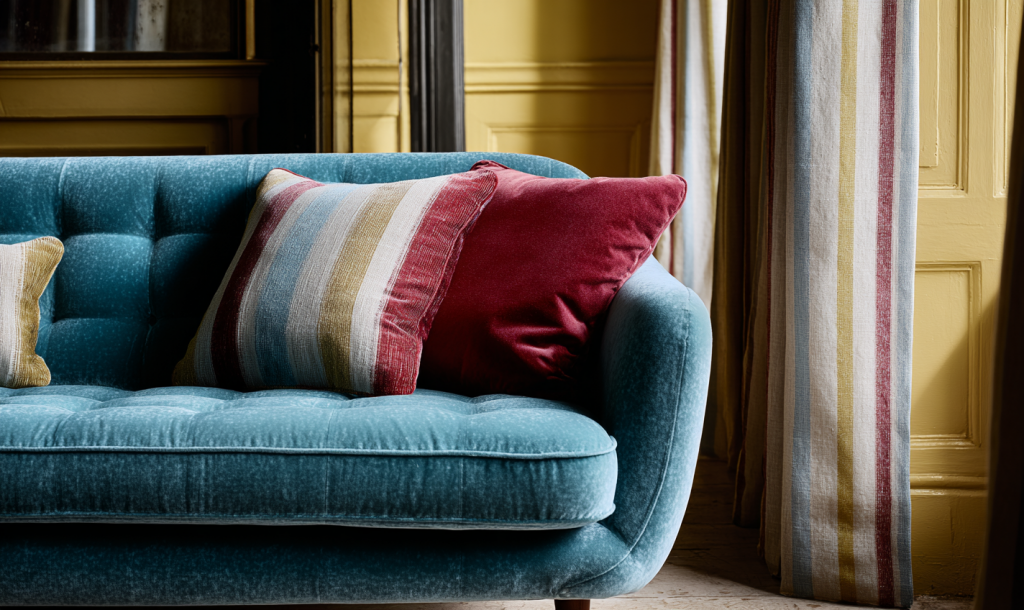
Balance the scale (large-scale on one, smaller on the other) and link them with a colour or motif. For example, a contemporary geometric rug with a stripe in the curtains can look refined and deliberate. A vintage Persian-style rug also has geometric elements which could work beautifully with similar shapes in a more contemporary curtain fabric.
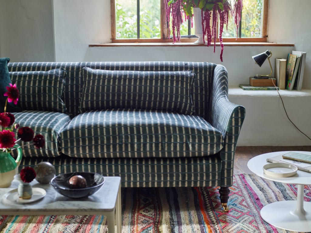
The recurring stripe motif on this traditional rug is picked up in the V&A Threads of India velvet on Sofa & Stuff’s Cromer sofa.
“I like pattern, but I need my bedroom to feel calm. Is that possible?”
Absolutely. Calm and pattern aren’t opposites.
The key is in the type of pattern and its tone. Pattern can add a quiet rhythm that’s deeply soothing, so consider gentle repeats that draw the eye softly rather than demand attention – patterns that immediately make sense rather than take up energy trying to find the repeat. And for a soothing bedroom, patterns with a hand-made nature can work better than sharp, digitally-printed definition – think Indian hand-block prints, painterly styles, or woven designs like a soft-edged Ikat.
“Can I use pattern if I have a small room or low ceilings, or will it shrink the space?”
A common misconception is that pattern will shrink a space.
Pattern can actually expand perceived dimensions when handled thoughtfully. Vertical motifs, stripes, and upward-leading shapes on the walls or full-length curtains can make a low ceiling feel taller.
A large-scale pattern in a small room can add energy and interest to it – if that is what you’d like. A shapely upholstered headboard in a small bedroom can add instant luxury when covered in a large colourful pattern, as Kit Kemp has proven so often. Conversely, a small-scale pattern used on the walls of a small room can subtly create a sense of space. The eye reads the repeat around the room, blurring boundaries and corners, giving the impression that the walls are receding rather than closing in.
The trick is proportion – not avoiding pattern, but matching its energy to the room’s size.
For more guidance on decorating smaller rooms, see my Small Space Living post.
“What’s the easiest way to start using pattern without a big commitment?”
Start small and low-risk: cushions, lampshades, a small ottoman or tie-on dining seat pads.
This helps you test what feels comfortable before committing to larger-scale decisions like wallpaper or upholstery.
Once you identify a pattern you truly love, use it as a foundation – repeating a colour or motif elsewhere to tie everything together.
Confidence grows with familiarity, so if you’re not sure give yourself a couple of weeks to see if you warm to it. Pattern doesn’t have to be an all-or-nothing choice.
“What colours should I pair with this patterned wallpaper/fabric so it all looks intentional?”
Begin by identifying the dominant colour, the secondary colour, and the background neutral in your chosen pattern.
Those three colours will guide the rest of the scheme.
Repeat the dominant tone sparingly to anchor the space; use the secondary hue in larger pieces such as curtains, sofa or bedding, and let the neutral provide balance.
If the palette still feels unsteady, look at undertones – warm versus cool – rather than hue alone. That’s where harmony lives.
Coming Soon: The Power of Pattern series
This post just skims the surface.
Over the coming weeks, I’ll be diving deeper into:
- Why we’re drawn to pattern and the emotions they evoke
- How to introduce pattern gently and test your comfort level
- How to use pattern to create layered interiors
If you’d like personal guidance now, my Pattern Power Consultation is a focused, one-to-one service that helps you understand your own unique connections to pattern – a useful exercise before committing to wallpaper, upholstery, or full decorative schemes.
These feel like difficult and uncertain times – everyone I know is worried about the economy, or our chaotic politics, the legacy we’re leaving for our kids, or the environment, and mental health… it goes on and on.
When the pandemic forced us all to stay inside, many of us realised how much our homes shape our wellbeing – how frustrating it feels when they don’t serve us, and how restorative they can be when they do. I feel like we’re back in those times, needing community, connection and calm. And that is central to what I consider ‘good design’.
Many of us might say that good design should meld form and function. But more recently I’ve been thinking of design along the lines of ‘kindess’, ‘connection’ and ‘growth’. For me it’s about understanding what makes people feel safe, inspired, and themselves – and designing around that. While design can be visually impressive, the most successful spaces work on an emotional and sensory level – they make you feel settled, comfortable, and able to be yourself (hopefully on a good day!) That is the essence of my aesthetic, which I’ve called Grounded Elegance: rooted in natural materials, classic proportions and a calm sense of ease.
It’s not a style you can buy off the shelf. It’s an attitude to living. But the ideas below on how you could decorate, light and furnish your home will certainly help you bring this aesthetic to your own space – creating a place that invites you to slow down, take off your shoes, and feel a sense of belonging.
A Home That Grounds You
A grounded interior begins with kindness. Kindness is about heartfelt choices which prioritise people over perfection. It doesn’t try too hard or chase trends. Instead, it draws on the tactile and the familiar. Materials play a big part in that – the silkiness of timber under your fingertips, the fine texture of a linen weave, the coolness of stone under bare feet. These sensory cues quietly anchor us, they create a sense of calm because they connect us to the natural world and to the passage of time. They are also wipeable and washable, because kindness is not about preciousness.
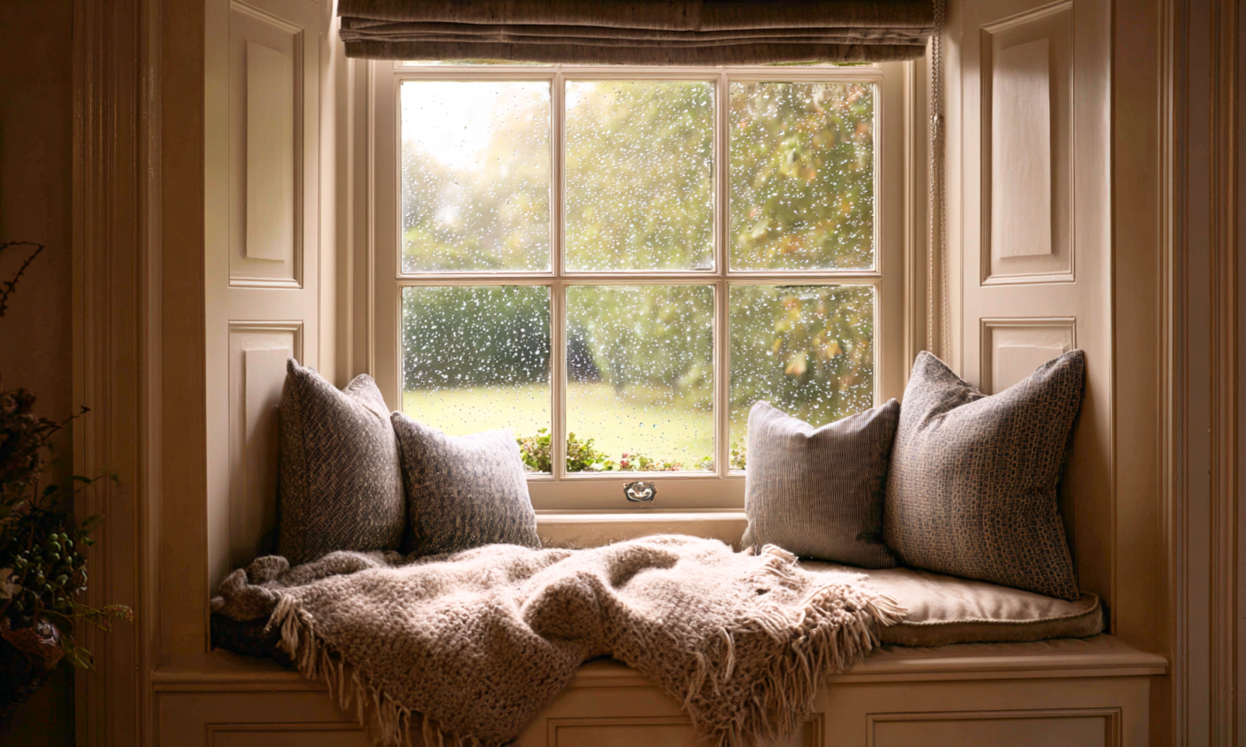
A dark hall becomes a cosy reading nook – or perhaps for an evening whiskey and a catch-up on the day.
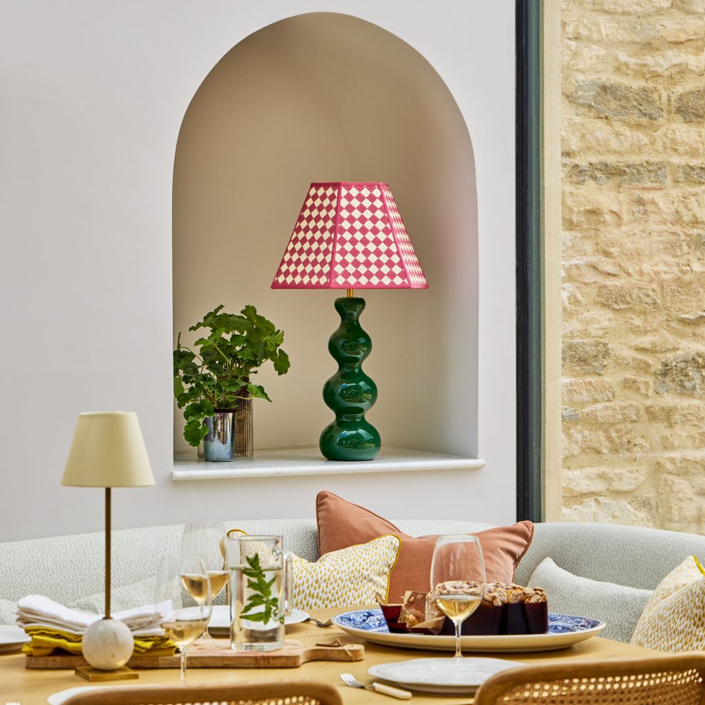
Lighting plays a major role in how welcoming a home feels – and creates connection. Harsh overhead lighting flattens a space, while layered lighting brings it to life. Try combining soft wall or picture lights, floor lamps, and table lamps to create pools of warmth. It’s these light ‘pools’ that bring people together – just think of the draw of a glowing open fire. You can create a similar ‘come hither’ space for your family, or just yourself, by softly lighting a reading nook or a couple of cosy armchairs. As I always say, dimmer switches are key – you might want brighter light for reading a book, but softer if you’re scrolling online pages, so give yourself the option of both. Similarly pop a table lamp on a side table to make a dark corner feel welcoming and inhabited – it’s often these understated pockets of light that make a room feel like home. And with the number of portable, rechargeable lamps available now (including these by Pooky), you don’t need to call in an electrician.
Elegance That Elevates Without Intimidating
Elegance doesn’t have to mean formality. It’s found in proportion, restraint, and detail – the grain of a vintage mahogany desk, the curve of a bronze cabinet handle. Consider an oval dining table with upholstered chairs that encourage conversation long after dessert is finished. When furniture is solid and comfortable, it creates refinement that feels lived-in rather than precious. It’s definitely not about some of the brutalist, blocky solid wood dining chairs I’ve seen in magazines recently – my glutes start to numb just looking at those.
Performance upholstery fabrics and natural blends are ideal for family homes – soft enough to touch, yet durable enough to withstand real life. Look for cotton-linen mixes, slubby weaves, and washable velvets. I’d chose washable over stain-resistant finishes due to the toxic chemicals within these.
Kindness is a chunky knitted throw and ‘come squish me’ cushions. Image courtesy of Dusk.com
The Human Thread in Design
Design that prioritises people rather than perfection always feels warmer. Before rearranging a room, think about how you move through it: where you could pause, play, or gather. Could a reading chair catch the morning light? Would a bench against the kitchen wall provide a place to chat while cooking? These small human gestures shape how a space is experienced.
Colour also has emotional weight. A palette of natural neutrals with pockets of richer tones – muddy reds, soft blues, olive greens – creates both harmony and depth. Choose colours that reflect how you want to feel in the room, not just how you want it to look. I cover this in more detail in the second post of my Confidence with Colour series.
Final thoughts:
Living with Grounded Elegance: Home as an Anchor
A home built on Grounded Elegance evolves with you, welcomes wear, adapts to changing routines, and improves with age. In a world that often feels unstable, a home like this becomes an anchor – somewhere steady when everything else seems uncertain.
Homes age, families shift, priorities evolve – and so should design. It’s why I take time to get to know clients beyond their colour preferences or furniture wish lists. I want to understand their rituals, the small moments that make them feel most themselves. Those moments are where the best design begins.
It’s not about perfection. It’s about living gracefully and celebrating imperfections – creating homes that support you now, and still feel like you, two decades later.
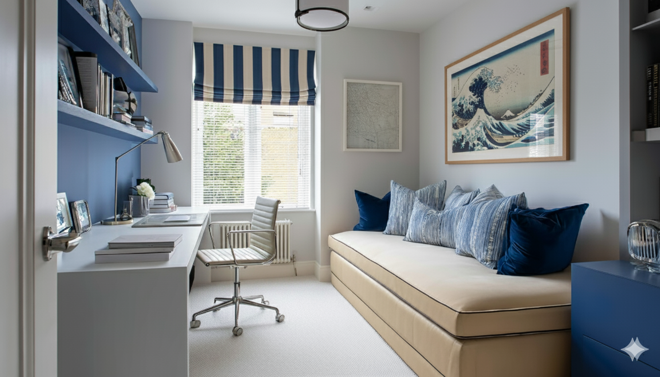
A single friend has recently moved into a new rental in central London – and typically, it’s short on space. He has a second bedroom, and was debating whether that should be a work from home office, stay as a bedroom, or be a combination of both. If it remained as a bedroom his kitchen-dining-living space has to serve as an office too – which can feel like he’s never escaping work. If it’s a combo office/guest room, how comfortable or welcoming can he make it whilst also meeting his work needs?It’s a design dilemma many people face, since modern living in generally smaller homes asks more of our rooms than ever before.
Designing for flexibility is less about compromise, and more about smart prioritisation – deciding what needs to function flawlessly, and what can lean into beauty and atmosphere.
Start with your hierarchy of use
Ask yourself: Which activity happens here most often?
That function deserves the best ergonomics, lighting and layout. For instance, if you use a “guest room-study” as an office three or four days a week, design it as an office first – desk choice and orientation, chair comfort and task lighting take priority. The guest room elements then layer in as secondary features: a sofa-bed instead of a permanent double, soft lighting that can be used for overnight stays, storage that hides work clutter out of sight.
I advised this friend to use the second bedroom as his office, rather than adding another function to his kitchen-dining-living room. But it also has to function as storage for ski-gear and various other man gubbins. So to keep a serene space for focused work, we’ve added another full-height storage cupboard to hide away distracting clutter.
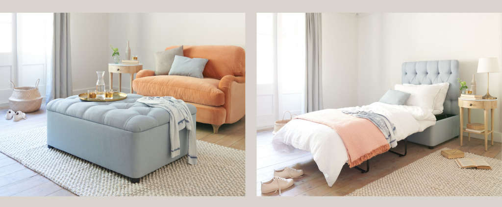
With a comfy mattress stashed inside Loaf’s deep button footstool, guests can enjoy a good sleep whichever room they are in. See link below.
Use furniture that earns its keep
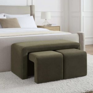
Furniture that can adapt are the hero pieces of a multi-functional space. This same friend will now put up guests in his living space. I’ve suggested various spare bed options – a daybed he could lounge on, a pull-out bed in an ottoman that he could use as an alternative coffee table, or a sofa bed. Personally I’d go for the ottoman option, since it also serves as spare seating when friends visit – three uses! Loaf has a number of these options.
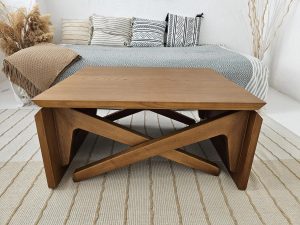
Another dual-use furniture item which can support a multifunctional room is an extendable table or rising coffee table. These can provide dinner-party dining space when that is needed. This every-day coffee table easily converts to a 6-seater dining table.
The Murphy, or wall bed deserves a mention here – yes it’s only used as a bed, but when it’s not in use it takes up only as much floorspace as a wide cupboard. This means it can be another guest bed option in a home office or snug. Alternatively, the more expensive designs are comfortable enough to use every night, which opens up the option for studio living when space really is a premium. My Small Space Living post provides more guidance on this.
Zone through light, texture and tone
Aside from furniture choices, multi-functional spaces need careful planning of their zones. Many new apartments and small homes have a single kitchen-living space, which is also for dining. But just as many older homes now have kitchen-diners which function as a busy family command centre in the morning to a homeworking space in the afternoon – as well as a kitchen. If you then want to host relaxing dinners for your partner, family or friends, you want a perceptible shift from military operation to cosy bistro. Instead of physical partitions, use light layering and material contrast to mark functional shifts.
- Use multiple lighting circuits with dimmer switches – once the meal is at the table, dim the lights on the kitchen clutter and enjoy the warmth of pendant lighting and candles or portable lights in the dining area.
- Textural changes from hard flooring to a large rug under the dining table – this signals the different zones. Top tip: make it a washable rug.
- Subtle colour variation helps define areas without chopping up the space; for example, use a deeper tone of the same hue for the dining area in an open-plan kitchen-dining-living room. Placing the dining area in the darkest area of the room is fine if you tend to use it mainly for evening meals – keep the brighter spaces for the kitchen and living areas.
Dim the lights on the dirty pans and utensils in the kitchen whilst you enjoy dinner with friends.
Prioritise storage and visual calm
Dual-purpose rooms can quickly feel chaotic. Hidden storage is the unsung hero – built-in joinery, ottomans, or modular sofas with under-seat storage that keep one function invisible while the other is in use.
In multi-functional rooms consider a “close-down routine” – invest in boxes and baskets ready to sweep away playroom toys or work papers when it’s time to use a seating area for relaxation or entertaining.
Let your design aesthetic anchor the space
Just because a room has more than one purpose doesn’t mean it should feel generic. A consistent design language – colour palette, materials, or recurring motif – can tie the functions together.
For example, a deep inky blue used on study joinery could reappear as the day bed cushion and then the bedlinen on the guest bed. Cohesion keeps the room intentional rather than improvised – and in the above example shows guests they are welcomed in that space rather than just a nuisance!
Final thought
The best multi-functional rooms feel effortlessly comfortable and welcoming – but that is through considerable design and planning. Decide what matters most, design for that function with precision, then layer in comfort and style for the secondary use. The result? A room that flexes gracefully as life demands it.
If you’re wrestling with a room that has to work twice as hard – guest-room-study, kitchen-diner-homework zone or something trickier – my Design Coaching sessions help you plan layouts, select furniture and find finishes that work beautifully for every purpose. I explain how these can help you here.
In the first post of this series we explored how the building itself – its light, orientation and architecture – can guide your colour choices. In the second, we delved into colour theory and psychology, showing how these principles shape mood and flow. So far, so theoretical. Now, in this third and final post, we’ll look at how to create an actual palette, by turning to external inspiration. From favourite artworks and cherished fabrics to the view of a garden outside your window, these reference points can become the anchors of a beautiful and personal scheme.
Colour inspiration doesn’t have to be invented – it’s all around you. Nature is a master of colour pairings, whilst artists and textile designers use both their artistic eye and their own application of colour theory to compose colours in their works. It makes sense to borrow from their expertise!
Start With What You Already Love
Look around your home at the pieces you already own and love – chances are, a large part of their appeal is within the colours they contain. Inspiration may come from:
- A patterned fabric on a chair or curtains.
- A rug that’s moved with you from home to home.
- A favourite piece of artwork or photography.
A single artwork or decorative object can drive an entire scheme. The trick is to look past the subject matter and study the colours:
- A landscape painting might offer a muted base tone with two bold accents.
- A vintage kilim rug may hold a dozen nuanced reds, greens and neutrals.
Another source of colour inspiration can come from the clothes you wear. Looking inside your wardrobe or drawers, is there a colour you’re drawn to time and time again across these items? How you dress yourself in colour can sometimes transfer well into how you dress your home as well.
These clothing, art and interiors items contain built‑in colour palettes. Place a paint chart next to them and then bring together the 3 or 4 colour chips that match the colours. See how they look together outside of the pattern, design or subject matter of the art.
Tip: Photograph your favourite piece (in natural daylight or as close to as possible) and use a digital colour‑picker tool such as https://coolors.co/ to extract its main hues. This creates a ready‑made palette to test in your space.
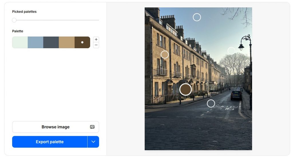
The Coolors website can extract palettes from your uploaded images, allowing you to play around with the various colours. Genius!
Borrow From Nature & YOUR Surroundings
Interior designers repeatedly return to nature as the richest palette source. Whether it’s a coastline, woodland walk or simply the changing view of plants from your kitchen window, the colours of nature are both timeless and grounding.
- In the South Downs landscapes around me, for example, chalky whites, muted greens, earthy browns and soft sky blues all translate beautifully into paint colours.
- Urban dwellers can look to seasonal change – spring blossom pinks, autumnal ochres, wintery blues and slate greys.
- The built environment can also provide inspiration – from painted shopfronts on your local high street to the colour combinations of old brickwork, roof tiles and shutters you pass on your commute.
Taking inspiration from nature blurs the boundaries between indoors and out – we’re forever hearing of interiors which ‘bring the outdoors inside’. This principle sits at the heart of biophilic design. Biophilic design is essentially about designing with nature in mind: maximising natural light and views of greenery, using shapes, patterns and textures found in nature, and drawing a colour palette from the landscape to create a sense of calm and restoration. It’s especially powerful when a room overlooks a garden because you’re reinforcing the real view with the design inside – creating a visual connection between the indoor and outdoor environment, which has been shown to reduce stress, improve mood and even boost productivity in that indoor space. For readers interested in learning more about this approach, watch this TedTalk by British biophilic designer Oliver Heath.
Tip: Next time you’re out walking or sitting by a view you love, stop and pick three or four colours you can see right there. Jot them down or photograph small sections close‑up rather than the whole scene. Back home, match these shades to paint chart chips or fabrics and you’ll have an instant, nature‑based palette to experiment with.
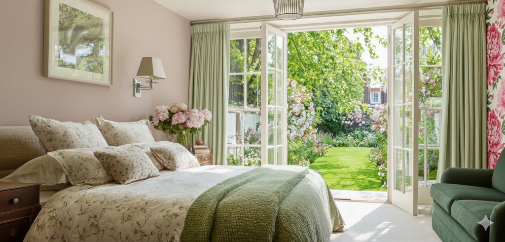
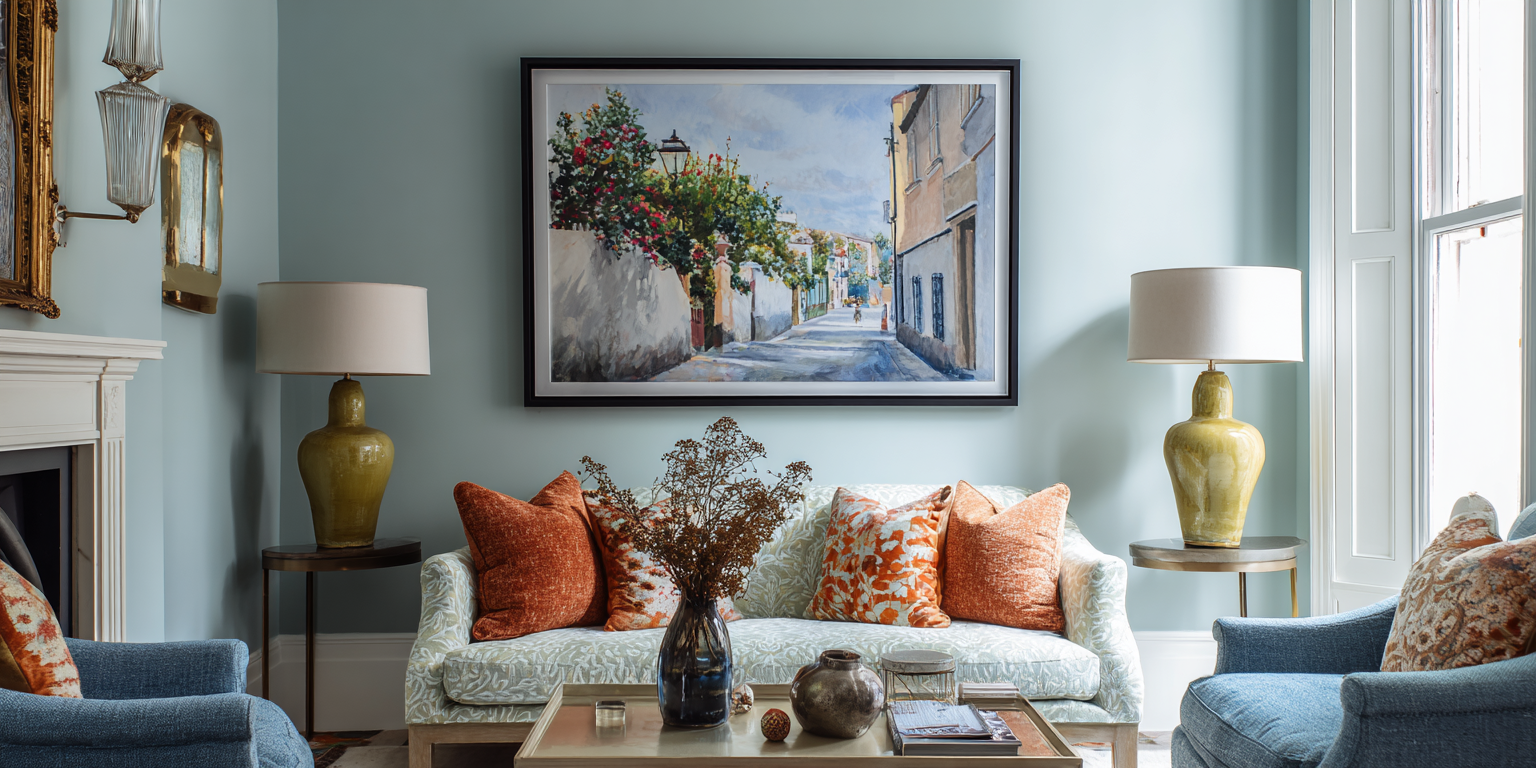
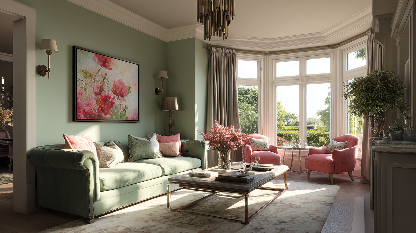
Inspired by the lush greenery and pink flowers of the garden, the decor of this bedroom visually connects us to the nature outside.
Take Cues from Hospitality Interiors
Hotels, restaurants, boutique cafés and spas are often masterclasses in colour and atmosphere. Designers in the hospitality world frequently use bold combinations, layered textures and lighting to create a mood or tell a story. Visiting a favourite bar or spa and noticing its palette can spark ideas for your own rooms: you might take a deep green from a hotel lounge and use it for joinery, or a soft plaster‑pink from a spa’s treatment room as inspiration for a bathroom.
Tip: When you’re in an inspiring interior, snap photos of colour combinations you love – not just single colours, but the way tones are layered with materials and lighting – and bring those references back to your mood board.
Make a Mini Mood Board
Combining your inspiration sources into a mood board – physical or digital – helps you capture all those colours and ideas in one place. A mood board is simply a visual collage or arrangement of swatches, photos, textures and notes. It gives you a quick, at‑a‑glance sense of how colours, materials and styles will work together before you commit. Include:
- A photo of your inspiration object or view.
- Paint swatches or digital colour chips.
- Fabric samples or images of furnishings.
- Any other finishes you already have or want in the room – wood, tiles, carpet etc.

A mood board is a simple but effective way of testing colour options from an inspiration source, in this instance a favourite mountain landscape
Seeing them side by side will start revealing some interesting insights to help you further develop the scheme:
- Does the palette feel fresh, warm, dramatic or calm?
- Whether one colour is dominant over the others and may therefore be an accent or highlighting colour in a room.
- If there’s something missing – would a splash of a complementary colour or something bright bring some fun or energy to the scheme?
Seeing the colours and textures together will help you identify which colours could be the major players and form the basis of your wall colours, and which are the supporting cast. There is a helpful rule of thumb you might consider, which is the 60:30:10 ratio: 60% of your scheme is the main base colour, 30% is a complementary second colour, and 10% is an accent colour which is often bolder or contrasting and brings energy and drama. In practice, this could be 60% on your walls, 30% on the trim and doors and your window dressing, and 10% in the light shades, scatter cushions or other accessories. If you’d like four colours in your scheme, this rule still works if you use 2 analogous colours (ones which sit next to each other on the colour wheel) in equal proportions for one of those parts of the ratio. Or use the same colour but in different levels of saturation – such as Paint & Paper Library’s Leather used in different intensities in this bathroom. You could then have different colours for the 30% and 10% proportions.
Have fun with this exercise – and don’t forget the importance of colour psychology covered in my second blog post, to ensure that the colours you’re selecting support how you want to feel in the space, be that calmed, energised or other. If the colours you’re using have come from a loved item, view or artwork, chances are you’re already creating a scheme that fills you with joy or peace.
Conclusion
This three‑part series has moved from the fixed (your building), through the structured (colour theory and psychology), to the personal (external inspiration). By considering these steps, you can now start to create a palette that feels authentic, cohesive and deeply connected to both your home and your life. The most successful schemes don’t just look good – they tell a story about you and your surroundings, and they’re a joy to live with every day.
If you’d like more of a guiding expert hand to prepare a colour palette that truly captures your personal tastes, request my Colour Consultation.
In the first post of this series, we looked at how the building itself – its orientation, natural light and architecture – can provide guidance for your colour choices. Starting with the room specifics grounds your scheme in the reality of your home. But once you’ve considered what the building is telling you, there’s another lens to apply: colour theory and psychology. Together, these help you create palettes that not only look cohesive but also make sure the room supports the mood and ambience you need from it.
The Colour Wheel in Practice
The colour wheel is a simple but powerful tool. It helps explain why some combinations feel balanced and harmonious, while others create energy or tension.
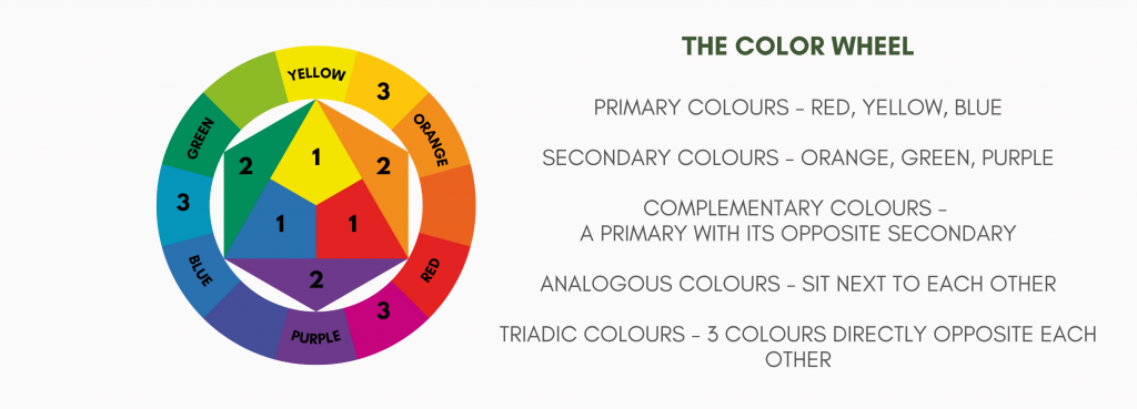
- Complementary colours sit opposite each other (blue and orange, red and green, yellow and purple). Together they create vibrancy and contrast. There’s a cool colour paired with a warm one. These combinations will be everywhere when you start looking – warm terracotta roof tiles against a vivid blue sky, a soft pink rose nestled in its green leaves.
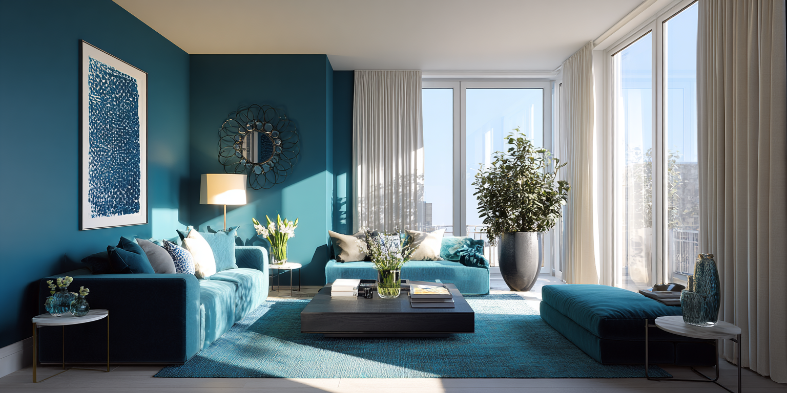
- Analogous colours sit side by side (blue, teal, green). These bring calm and unity. Think of a handful of collected sea-glass from a beach.
- Monochrome schemes use a single colour in different tints, from pale through to deep. This creates sophistication and flow. It can be serene in pale colours or dramatic in richer ones.
- Triadic palettes combine three colours evenly spaced around the wheel, such as blues, red and yellows. Used carefully, they bring energy and playfulness.
Tip: Create a small test board with three swatches from different parts of the wheel and place them side by side. Notice how you respond to these combinations – are they lively, calm, or dramatic.
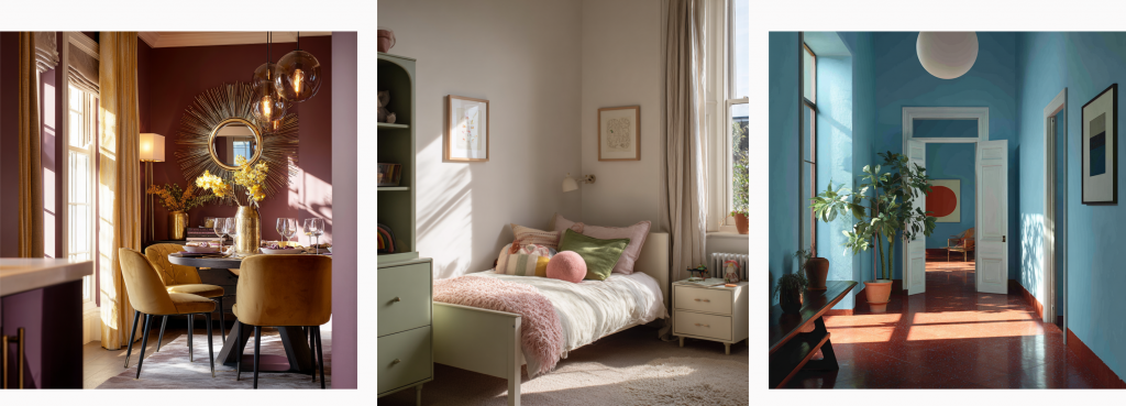
Three different complementary colour schemes showing how they can bring both drama and calm.
Tonal Variation and Flow
Have you noticed how many paint brands now provide their colour in different levels of saturation, suggesting combinations of them be used across ceiling, walls and trim? Using pale, mid and dark versions of the same colour is one of the simplest ways to build an elegant colour scheme for a room and cohesion across your home. The latter allows each room to have its own character while maintaining a thread of consistency.
- For example, a pale aqua in the hallway, a mid teal in the sitting room, and a deep cobalt in the study. Each space feels distinct, but together they tell a story.
- Tonal layering within a single room works particularly well when there is painted joinery, such as built-in book shelves, or in your kitchen.
Tip: If you want to create a feature wall with a different shade of your colour, a darker shade will advance towards you and visually foreshorten the room, whereas a paler tint will recede away and lengthen the room. This can be a useful trick in rooms with difficult dimensions.
Quick sidebar: you might be wondering what’s the difference between a tint, a shade, and a tone. Good question. A tint is a colour to which white has been added to lighten it. Peach is a tint of orange. A tone is a colour to which grey has been added to desaturate it or create subtlety. Sage green is a tone of green. And a shade is a colour to which black has been added to darken or enrich it – navy blue being an example. Whilst we’re here, a hue is the pure colour itself, such as red or blue.
Contrast and Balance
Colour isn’t only about hue – it’s about contrast. The balance between light and dark, cool and warm, these shape how a space feels.
- Contrast for drama: Deeply coloured walls with crisp white trim, or a bold feature wall, create energy and a striking effect.
- Harmony for calm: Tone-on-tone schemes, where walls, ceilings and trims are all close in depth, feel more restful and seamless. Layered neutrals are an elegant version of this. See Kelly Hoppen’s work for a masterclass in that.
The similar shades, or softness, of the blue, yellow and red in this triadic scheme show how harmoniously they work together.
Colour Psychology
Colour has long been known to elicit an emotional and behavioural response. Karen Haller, author of The Little Book of Colour, explains that the psychology of colour is about how colours work together to influence behaviour. She writes “We see colour with our eyes, but the real magic happens in the brain. Once colour is processed, it triggers an emotional and physiological response, altering how we feel and behave. This is why understanding the role of colour psychology in interior design is so powerful.”
- Blues and greens are calming, restorative, often linked to nature and balance. Good choices for bedrooms and bathrooms.
- Yellows and orange are sociable, uplifting, energising. Perfect for kitchens or dining spaces.
- Neutrals: grounding, versatile, restful. A reliable backdrop in any room, but especially good for busy family spaces.
- Reds and pinks: stimulating, enveloping, romantic. Depending on the tone, they can create warmth in living spaces or intimacy in dining rooms.
By aligning colour psychology with room function, you create spaces that support how you live. A calming green study aids focus for some, whereas others may seek creative stimulation and energy from a triadic scheme. Sophie Robinson, so recognised for her colourful schemes, tells how she originally painted her study in soothing (sensible?) pales – only to feel totally flat in it. Once she’d followed her instincts and redecorated it in vibrant colours and pattern, her creativity soared.
Our response to colour can be from our own past experiences or from cultural messages. In my design process, and particularly the Colour Consultation I offer, I encourage clients to recall favourite scenes and moments from their life and consider the colours from those.
Tip: Forget about colour trends or what you’re seeing on a paint chart. Think about the colours you’re instinctively drawn to, and then how they make you feel. Consider how these can be incorporated into your colour scheme.
Conclusion
In Part One I explained how the building can provide a useful structure for scheme choices. Colour theory gives you the science. And psychology makes it personal. By layering these together, you can move beyond trial and error into creating schemes that are both cohesive and emotionally resonant.
In the final post of this series, we’ll look at the third layer: inspiration. From the landscapes outside your window to the artwork and objects you love most, these sources can become the anchor points for your palette – the step that makes a scheme uniquely yours.
Choosing paint colours can for some people feel exciting, filling them with creative joy. But for others they may only feel overwhelmed – the horror of hundreds of swatches, conflicting advice, and the fear of making a mistake.
This is the first in a three-part series on how to select colours with confidence. We’ll start in this post with how your home itself can guide you on the colour selection journey: what it can suggest through its orientation, dimensions and architectural character. The second post will explore how a knowledge of colour theory and psychology can shape the formation of your palette, and the final post will look at the role of inspiration, turning to what you already connect with for direction. By the end of this short series I hope you’ll join me in embracing the selection of colour palettes.
So, onto our first lesson which is about what your building is telling you – through its light, architecture and character. The room you are decorating is one of a kind, unique – there is no other room that has this exact location, these exact dimensions, these same materials, these same light levels. But, whilst this might feel unnerving, there is some useful guidance you can apply to the room and its location.
Orientation & Light
The way natural light enters a room changes how colour behaves. This depends both on the timing of the light, and the direction from which it comes.
The quality and hue of light changes during the day – from subtly blue in the morning, neutral around midday and softly golden in the last few hours. So think about when you will be using the room – is this a bedroom in which you’re an early-bird who likes to wake to the sunrise, or is it a bathroom which tends to be used for relaxing evening soak?
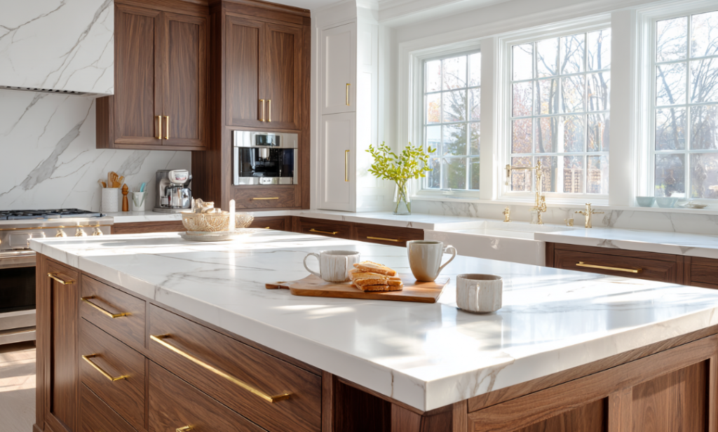
The bright morning light of this kitchen is amplified by the white walls and marble, but warmed by the walnut cabinetry and brass fittings.
If you’re tackling a morning room with lots of natural light, you might want to lean into the crisp morning light with a fresh blue palette – but avoid blues with a hint of purple or lilac, which risk looking icy in the morning and then murky for the rest of the day. Blues with a subtle green undertone work better, something a bit turquoise like Farrow & Ball’s Blue Ground.
If you’d prefer to warm up your morning room, turn to colours that counter the blue light – soft yellows, blush pinks, earthy-based neutrals like Little Greene’s popular Silent White, or yellow-based greens such as Portland Stone.
Where your room is flooded with warm evening light, you might want to embrace that to create a room that positively glows – pinks, corals, or ochres will do just that. If you’d prefer a light neutral or a typically cool colour (blue, green, grey) in an evening room, I’d still suggest a warm undertone so that the room is still welcoming throughout the day. Teal looks fresh during the day and luxurious in golden light.
Next to consider is the orientation, which builds on this concept of the light spectrum throughout the day. I’m based in the northern hemisphere, so this guidance can be reversed for readers in the southern hemisphere.
The choice of vibrant Vardo creates an indulgent and stimulating north-facing dining room, image courtesy of Farrow & Ball.
North-facing rooms receive a steady level of fairly cool light throughout the day. It’s for this reason artists like a north-facing room. This light feels muted, which makes pale colours look flat, or as some say, a bit ‘meh’. Softer, yellow-based neutrals or warm, earthy tones help bring comfort to these spaces. Stronger, darker shades can also work well, creating a cocooning feel. Deep berry colours, chocolatey browns and luxurious teals can turn an unloved north-facing room into something bold, sumptuous and memorable, and these colours glow under the artificial light you’ll use in the evening here. Whatever you do, don’t paint a north room white under the assumption it will look brighter. It won’t – it will look sad.
South-facing rooms are bathed in bright light for much of the day. You have more choice in these rooms. Cool blues, greens and greys sing in these rooms, creating a fresh and uplifting mood. If you like pastels, they work well in these rooms, especially mint greens or aqua blues, as they maintain their brightness without becoming icy or washed out (pastel pinks or pale corals would also work in the cool light of a north or east facing room). Saturated brights and deep inky blues work well in south-facing rooms, especially with contrasting pale or white ceilings and trims.
East-facing rooms capture crisp morning light but levels become muted and softer after noon. Fresh, uplifting hues like soft yellows, delicate greens or warmer pastels often work best, as described in the morning light section.
West-facing rooms have fairly flat levels of light for most of the day but can then positively glow in the evening – warmer tones capitalise on that golden light, while neutrals become warmer as the day progresses. If you want drama, go for the boldly saturated warms such as Little Greene’s Nether Red. The low sloped ceiling and walls of my west-facing ensuite, painted in Setting Plaster, becomes irresistible for an evening bath when the golden-hour sun pours in. And in the dull early morning its gentle pink provides a soothing start to the day.
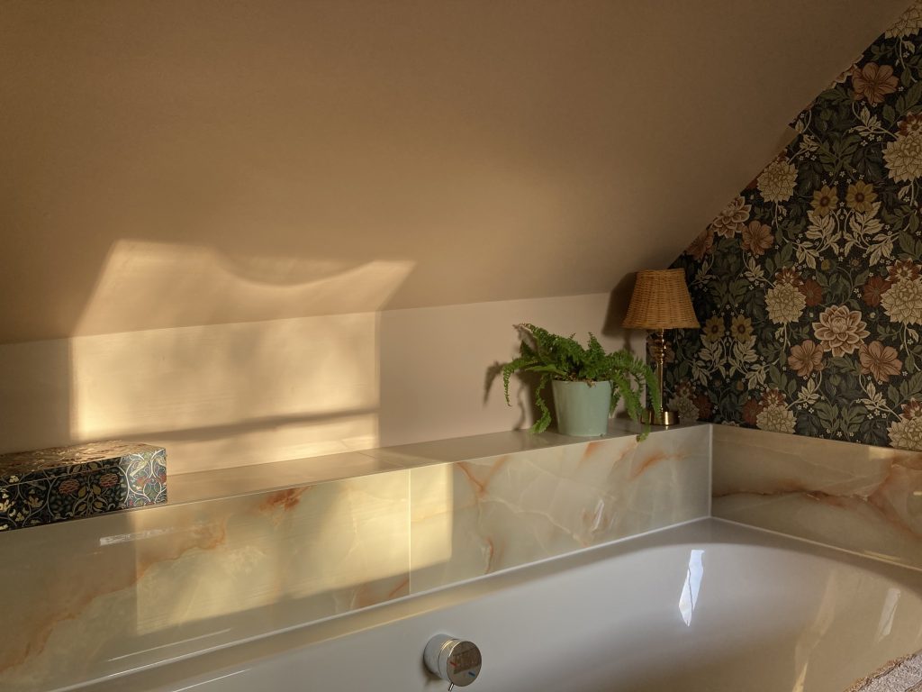
Evening sunlight brings a golden glow to the pink tones of Farrow & Ball’s Setting Plaster in my ensuite bathroom.
If your room is dual aspect, think again about which part of the day you use it most and focus on the aspect illuminating it at that time. The dual aspect with the greatest impact on paint colour is east-west, due to the change from blue to golden light throughout the day. Embrace the drama – a saturated warm blue would work well, as would warm neutrals, blush pinks and soft green- or earthy-based greys.
A brief sidebar on working from home. With a lot of us working some or a lot of the time in a room at home, this is a room to pay attention to. Ideally I’d say use an east- or south-facing room, because some morning light or sunshine will make this a much more pleasant space to start the working day.
Tip 1: Observe a room at several times of day. Note how shadows fall and how natural light shifts. Stick multiple large (A4 at least) swatches of your possible paint colour on every wall. You may find a colour looks perfect in morning light but dull at dusk.
Tip 2: Place two large swatches of a colour together in a corner to see how the colour reacts bouncing off itself. This is useful for a single colour, but essential if you’re planning a feature wall in a different colour.
Now lets look at the room itself more closely, at the Architecture & Period Features
Dimensions
Colour can both enhance and alter the perceived dimensions of a room, and thus your experience in it.
If you have a large room, lighter and less saturated colours can maximise the sense of space. If it’s filled with light, you might want to enhance that and keep the walls and ceilings light and neutral to celebrate the light as it moves across them throughout the day. If it’s not filled with light, then celebrate colour instead, with greater levels of saturation. And if you want a large room to feel smaller, bring in contrasts of colour: a deeply coloured feature wall that visually advances towards you, or contrasting skirting, coving and trim (be they lighter or darker than the walls) avoids the sense of limitless space felt when everything is the same colour.

The pale grey walls of this light-flooded living and dining room enhance the sense of space
A smaller room will benefit from a single colour drench – on walls, ceiling and trim – so that your eye does not easily see the boundaries and feels larger. The fewer the colours the greater the effect of space in these rooms. Strong and saturated colours work well in small rooms, where the colours double up on themselves in the corners. I’d suggest focusing on making small rooms cosy and embracing – even if you want them to be relaxing spaces, as we’ll discuss in the second post of this series.
Fixed Elements
Your home’s architectural character could also guide your choices. Beamed ceilings, encaustic floor tiles, exposed brickwork or stone fireplaces all carry their own tones and textures. Rather than competing with these, paint colour should enhance them – so bring them into the colour palette debate right from the start. And try not to see them as limitations – rather, they can be the starting points or inspiration. Look carefully at that stone fireplace and see how many subtle colours start revealing themselves in the veins etc. Or consider that if you are lucky to have something special like gloriously rich parquet flooring, perhaps that should have most of the attention and you can keep the walls pale and unobtrusive.
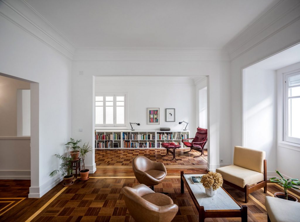
Why distract from the glorious parquet in this 1930s property by Lisbon-based architects Aboim Inglez Arquitectos?
The architectural period of your home can also guide colour choices. Without being a slave to history, you might want to look to the typical colour palettes associated with the period in which your home was built. I have written in more detail about this in my post on Heritage Colour Palettes. Contemporary homes can often take crisper and brighter colours than might suit, for example, an 1800s cottage. But these rules aren’t hard and fast. What is helpful is that many of the paint brands have developed specific heritage colour palettes, or comment on which colours might suit contemporary homes or schemes.
Tip 3: Walk through your room(s) with a notebook, jotting down orientation, features to keep or disguise, and existing materials. This becomes the framework for your colour scheme development.
Starting with the building itself is a logical first step for your colour scheme. In the next post we’ll look at how colour theory and psychology can apply an additional lens through which to focus.
I’m a sucker for small space living – maybe it came from a few canal boat holidays as a child, where my uncle’s boats filled me with delight at their clever use of limited space. Or maybe it’s the den maker in me, from an even younger age, playing for hours in a tiny indoor tent made from a bedsheet, a clothes dryer and the back of a dining chair.
On a global scale, British homes are small. A 2025 World Population Review survey of house size by country states the average size of a house in the United Kingdom is 818 square feet, or 76 square meters. Compare that to the largest – Australia, not America as you might have thought – where the average is 2,303 square feet, or 214 square meters. Yep, you can fit nearly3 British homes into one Australian one. British homes are the smallest of European ones, which range from Denmark’s 1,475 square feet to Italy’s 872 square feet. I think this reflects how many European countries have seen a shift to apartment living – no doubt due to the increasing cost of construction, pressures on infrastructure and the complexities of planning legislation.
But, as my mum has always said, the best things come in small packages. I think she was referring to diamond rings. Or me. We might aspire to living in a sprawling space, but remember that they come with more maintenance responsibility and cost, not to mention the heating bills. So whilst some might feel we’re being compromised on space, there’s a growing movement in ‘small space living’ – the tiny home movement and ‘van life’ come to mind. Necessity is the mother of invention, leading to some clever use of our limited space to live comfortably. Here are some of my favourites.
Space planning
Let’s start with the basics – you have limited floor space, so use it wisely. The priority for a comfortable home is to have uninterrupted circulation space, or flow as we often call it. Think about what you do in each space – I won’t say room, as some rooms have multiple functions and could need specific spaces for these within them. Who is using them, and when – what are their task needs, storage needs, seating needs etc? It needn’t be a PhD level analysis, but putting in a bit of thought at the start will help. Maybe you don’t need a large sofa if your family aren’t watching TV together anymore (teenagers anyone?) Maybe your footstools provide additional seating when it’s occasionally needed.
Which leads nicely to…
Bampton King Storage Ottoman With Puddletown Headboard – ideal for decluttering your space and storing extra bedding etc. www.darlingsofchelsea.co.uk
Flexible or multipurpose furniture
In another nod to my childhood, some of us were delighted by the 1980s TV show Transformers and the accompanying toys that opened up from a car into a robot. That delight continues for me in furniture that makes me say ‘oooh, that’s clever!’ It may be hidden storage (essential in a small home) or perhaps a pull-out table. IKEA has long been a leader in compact living design – Sweden’s houses average 893 square feet. It’s worth a wander around their room-set stores (take a deep breath, you can do it) for inspiration at least. Just be sure to balance comfort and practicality, you need to actually be comfortable sitting at or on something clever. Think carefully and ideally test something before you’re seduced by the cleverness of something. Here are my current favourite offerings.
Dusk’s Hoxton 3-in-1 footstools could equally work as a coffee table:
https://dusk.com/products/hoxton-nesting-bench-olive
Ikea’s Lindbyn vanity or hallway mirror has useful storage behind it. https://www.ikea.com/gb/en/p/lindbyn-mirror-with-storage-black-10458611/
Steelwooddpua on Etsy sell this coffee table which lifts to become a dining table for 6. https://www.etsy.com/uk/listing/1757236988/transformer-table-2-in-1-table-coffee
Vertical living – go tall
Having mentioned floor space already, don’t forget your wall space, or your ceiling space for that matter. There’s a lot of wasted real estate up there. If you’re a book lover, you could have meters and meters of book storage on simple shelves running along walls level with the tops of your doors. It looks visually interesting and uses otherwise dead space. Shelves at any height are a flexible solution, allowing you to swap in artwork or decorative storage boxes/baskets.
If you’re considering a kitchen overhaul, then look into extra-tall wall units, or even built in ones to the ceiling if budget allows. You’ll have masses more storage and will remove the greasy dust traps that are the top of kitchen cupboards. And if ever there was a design to elicit my ‘oooh that’s clever!’ response, take a look at these pull-out steps for tall cupboards or short people!
The kitchen is another room in which we can use wall hanging space. Pans or utensils hung from brass rails will free up counter space or drawers – decluttering your counters is always helpful in compact spaces.
If you’re lucky enough to be building or structurally adapting a small home, then use floor-to-ceiling storage walls instead of just standard walls – imagine how much you can fit into a cupboard 2.4m high by 2m long.
The general idea here is to think in terms of volume not just square footage – look up.
Create a sense of space
In using your wall space, and thinking of volumes, you are already thinking about the visual impact of being able to see or perceive space. Designers talk about negative space – blank spaces which provide visual and spatial relief for the eye. That might seem impossible in a small home, but it can be achieved a number of ways.
Being able to see more of the floor, uninterrupted, can create that perception of space. So choose a sofa and armchairs with clear space beneath and visible legs – you’ll be surprised how seeing the expanse of floor beneath adds a sense of spaciousness. Mid-century styles work well for this reason. This is a useful trick in bathrooms too, where wall-hung toilets and vanity units are increasingly popular not only for spaciousness but also for cleaning the floor. There are many wall-hung living room media units, hallway cabinets and bedside tables – all will help create a sense of spaciousness.
Keep it light
I have advised clients in the past to steal space from outside. By this I mean keep their view of the outside as clear as possible, so that the eye can see horizons beyond their four walls. Using sheer curtains so that you can always see outside helps (add a black-out blind if that is needed, making sure it doesn’t obstruct too much of the window when folded or rolled back). Sheer curtains also stack back far more tightly, saving space around your window when they are open.
But there’s another reason to maximise your windows. Light – especially natural light – changes how we read space. In a dim room, shadows define edges and make walls, ceilings and furniture feel closer together. Bright, even light softens those shadows, pushing visual boundaries further away. Our eyes instinctively read brightness and clarity as signs of distance (a trick from how we see landscapes outdoors – distant objects look lighter and less contrasted), so bright rooms feel deeper and more open. When that light bounces off pale or reflective surfaces, it spreads further, lifting ceilings and widening walls in our perception. The result isn’t just a brighter room – it’s one that feels instantly more spacious.
Mirrors enhance small spaces in two ways. First, by bouncing daylight deeper into the room, they lift light levels and brighten darker corners. Second, the reflection itself acts like a visual extension – when you see part of the room repeated in the mirror, it tricks the brain into believing there’s more depth and volume. Placing a mirror opposite or at an angle to a window can deliver both benefits at once, making even the smallest British rooms feel lighter, airier, and more expansive.
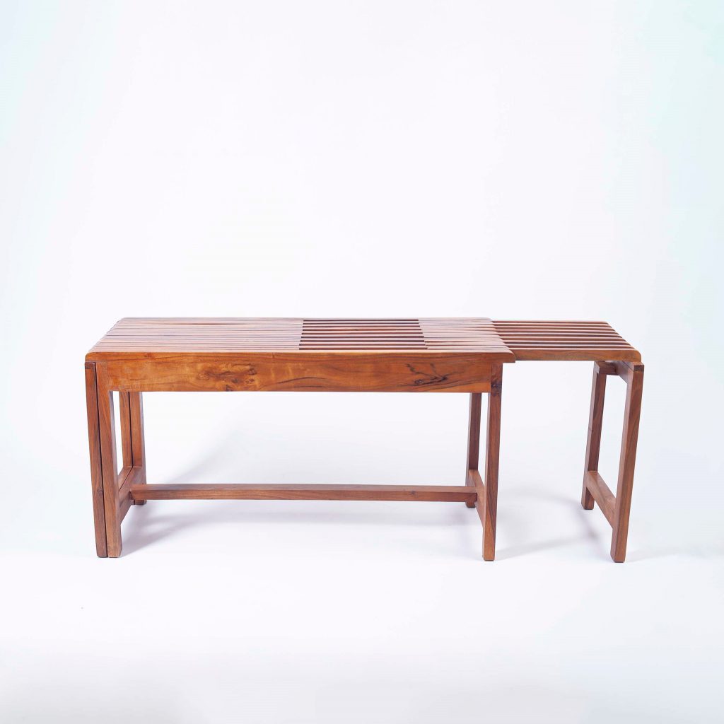
After Noah’s elegant wooden bench cleverly extends to suit your space and needs. https://afternoah.com/product/wooden-extendable-bench
Final thoughts
Many of our homes will never rival the floor plans of American McMansions or their Australian counterparts, but they can exceed them in charm, functionality and sheer inventiveness. Every inch becomes more valuable, so every design choice matters – and that can be liberating rather than limiting.
Ultimately, creating space – or the sense of it – is less about chasing square footage and more about working with what you have, intelligently and intentionally. Light, reflection, flow, and clever storage can all transform the way a home feels. Whether you’re hanging shelves above a doorway, choosing a wall-hung vanity, or simply keeping your view to the outside clear, each choice adds up. In the end, the real luxury is not size, but a home that works beautifully for the life you lead. I’ve written before how Effortless Design should support the way we want to live, and it’s in this context that I believe such choices feel authentic.
From canal boat galleys to blanket forts, I’ve learned that the best spaces aren’t always the biggest – they’re the ones designed with imagination.

A cursory glance at any of the social media platforms is bound to bring up at least one mention of an ‘effortless interior’ or of the ‘effortless chic/style/elegance’ of a room. The same when flicking through interior design magazines – there’s that slippery ‘effortless’ word again. It’s sold to us as aspirational, touted by interior designers as their secret sauce. But what does it mean? And why is it so popular?
Defining ‘effortless’ interiors
I think a lot of people would describe an effortless interior as a space that is inviting, one that encourages you to relax – perhaps a soft cream linen sofa with a wool throw over the arm, a well-thumbed book casually open on the spacious ottoman in front, sunlight streaming through French-doors beyond, with billowing sheer curtains. It’s a welcoming room that seems to just ‘happen’, and in its own casual laissez-faire, encourages you as the occupant to be the same.
But ask an interior designer what they mean by effortless and they’ll start listing off various design ingredients, choices and rules – ah, so this isn’t just happening, it’s now structured around numerous intentional decisions, purchases and guidelines. Are you spotting the paradox? How about the contradiction (my emphases) in this designer’s comment I just read in an article on ‘effortless’ style: “Mismatch things and don’t worry about it, as long as you ensure to have the scale and form of your furnishings in order, it doesn’t matter if you’ve got a fabric clash.” Now, rather than just seeing the metaphorical swan gliding along serenely, we’re thinking of the feet furiously paddling beneath.
That list of ingredients by interior designers contains, amongst others:
- A relaxed, organic aesthetic
- Understated luxury – nothing shouty, brash or ostentatious
- A space that feels serene, uncluttered, and lived-in
- Collections that have evolved over time (not imported wholesale in a weekend)
In another article on this subject I saw a huge coffee table on which were eleven artfully and diligently arranged low piles of books, along with a bowl of pomegranates. This feels contradictory to me: the books themselves encourage reading, which is a wonderful way to spend some time. But I bet my bottom dollar that the owner of said room is going to carefully align those piles again at the end of the day. What an effort! And heaven forbid a guest should grab a pomegranate and just bite into it – juice and mess everywhere. So these too have become artifice and pretension.
A gazillion scatter cushions to arrange (I never karate chop them) does not make for effortless living.
Which design choices create the effortless look?
Perhaps it’s easier to look at what’s going on behind the scenes. By this I mean like the ‘back of house’ in a stately home – the working choices that create the impression of ease out front.
Storage
– Ideally built in, perhaps hidden, but generally copious places into which you can sweep the detritus of everyday or family living and close the door/lid on it.
Lighting
– Not just a mid-ceiling pendant light here, we’re talking multiple heights, multiple circuits, definitely dimmers, and a mix of discrete lighting with a few fittings that are beautiful features in and of themselves.
Practical, hardworking materials
– Ideally which don’t need masses of maintenance: stone floors, bronze fittings, vintage wood. Materials you don’t have to be precious about.
Add to that tactile materials
– I was going to put leather in the practical materials section, but recoiling from a cold leather sofa in winter is not conducive to effortless comfort. So tactile materials should be lovely under bare feet, soft to sit on with bare legs, and inviting to stroke or hold. Ceramic mugs, wool or silk-mix rugs, linen. Notice these are all natural.
Symmetry
– Whilst we might think this creates formal (read stuffy) rooms, actually symmetry is restful for the eye and induces calm in our order-seeking brains. Bookcases either side of a chimney breast, two armchairs opposite a sofa that are placed equidistant from an imaginary mid-line down the room. Simply pairing things (not necessarily matched) can create this sense of ease.

For some, effortless living is the ease of dressing in a well organised, functioning and illuminated walk-in wardrobe/closet.
Why do we want effortless interiors?
This is where things get interesting – and perhaps a little uncomfortable.
The desire for effortless interiors often mirrors a broader cultural pressure: the pressure to appear as if we’re holding everything together without visible struggle. It’s the domestic equivalent of the “effortlessly chic” woman – well-dressed, perfectly manicured, successful, but never trying too hard.
Fashion and interiors are useful comparisons, and I found an article on the delightfully lyrical Italian term sprezzatura, which loosely translates as ‘studied carelessness’. Various Italian fashion leaders commented in this article, one saying “sprezzatura is the power of relaxation. It’s the total absence of the fear of judgement, and is demonstrated when you – not intentionally – but casually break certain rules of dressing.”
Whilst that sounds great, nearly all the quoted designers went on to say this style is innate, something that cannot be learned, and becomes a pastiche if emulated. Suddenly it’s all feeling very elitist, very much for the ‘gifted’ few.
And this is the danger for the interior design application of effortless style. We risk it becoming focused on social signalling – spaces created to suggest (never shout) ease and order, showcasing inauthentic perfection that mask the stress and effort beneath.
However I think we can steer away from this unpalatable view if we instead focus on the function of effortless design. When we go back to that list above of the ‘behind the scenes’ design factors, we see that they focus on design that enhances every day living. Well organised storage makes cooking easier or school-run exits faster. Hardworking materials require less or faster cleaning, or encourage us to welcome rather than fight their worn patina.
I’m not going to tell you how to ‘get’ the look.
But nothing in life is effortless – we’d surely be vegetables if we put in no effort at all. So let’s remember this is about spaces that enhance our daily living rather than tripping it up.
As an interior designer I definitely see that our profession can assist clients with elements that will support ‘less effortful’ living – the space planning, the knowledge of materials, and taking on the pain of the literally hundreds of choices and decisions during a renovation (see my post on “Why Can’t I Just Pick One?” The Stress of Too Much Choice.)
But I would also encourage my clients’ design choices to be based on their distinct personalities – which are themselves the result of emotions, memories, upbringings, life choices. Because effortless design should be based around you, and true to your lifestyle. It should, above all things, be authentic.
Maybe it’s time we stopped chasing the illusion of effortlessness – and started designing for the reality of living.

There’s something about historic homes that stirs the heart. Perhaps it’s the creak of old floorboards, the curve of a bannister polished by a century of hands, or the weight of a door that’s swung open a thousand times. In an age of efficiency and uniformity, many of us are drawn to the imperfect charm and lasting craftsmanship of older homes. These buildings embrace us gently and invite us to explore their quiet stories.
As a designer who works with period homes – and who lives in one myself – I know their charm is no accident. There’s a rhythm to these properties: a sense of human scale, material honesty, and craftsmanship that modern builds rarely match. And when designing for them, the most successful schemes are those that step in beat to that rhythm.
What Makes Historic Homes So Appealing?
While every house is unique, most period homes share certain qualities that make them deeply desirable to live in – and incredibly rewarding to design for.
Architectural Character
Original cornices, fireplaces, deeply recessed windows, exposed beams, and panelled doors are more than decorative flourishes – they bring authenticity and a sense of permanence. Some features reflect the fashions of their time – such as Arts & Crafts carved panelling or colourfully glazed Victorian wall tiles – but they were often grounded in proportion, purpose, and craftsmanship.

This designer, featured on TheNordroom.com, has embraced a potentially awkward dormer window space to create a seating nook.
Natural Materials with a Story
Aged oak, worn stone, lime plaster, forged iron, terracotta – these materials mellow beautifully over time, developing a softness and richness that modern substitutes rarely replicate. They lend texture, tactility, and grounding to a space.
A Sense of Evolution
Many historic homes have changed and adapted over the centuries, with layers of paint, unexpected level changes, and architectural quirks to show for it. That patchwork is part of their charm. These aren’t blank slates – they’re spaces with stories. Your new wallpaper is another chapter; the scratches in the floorboards speak of your everyday life.
Design Lessons from historic homes
So what can today’s homeowners learn from historic homes? And how do we embrace the past while still living comfortably in the present?
Embrace the Quirks
Not every wall will be straight. Not every floor will sit level. These quirks are part of what give period homes their soul. When a friend first saw my early 1800s cottage, she asked if I was planning to straighten out the bulging bathroom wall. I told her if I started there, I’d need to straighten out the entire house!
Instead of erasing these oddities, work with them. Commission bespoke joinery (or custom millwork if you’re US-based), add castors or leg extenders to furniture on sloping floors, and sew a draught excluder (aka draft stopper) in a favourite fabric. Even better – spotlight the quirks of your historic home with lighting, such as soft fairy lights wrapped around the beams in an attic bedroom.
Balance Modern Needs with Gentle Intervention
Modernising a historic home doesn’t mean stripping away its essence. But neither does it mean you must live in a time capsule. Underfloor heating beneath reclaimed stone, double glazing that respects heritage proportions, or sleek appliances fitted within a traditional scullery layout – these updates allow comfort and character to coexist.
In my own period home, I’ve fitted an air source heat pump, replaced aged double glazing with more energy efficient cottage-style versions, and transformed an uninviting en-suite into a warm, insulated sanctuary. The aim is to enhance, not compete.

Using a free-standing stainless steel kitchen works with the acute angles of this cottage. Image from realhomes.com
Layer the Old with the New
Some of the most beautiful historic homes embrace contrast: a vintage console behind a modern sofa, contemporary art above a carved Georgian fireplace, or a striking modern pendant hung in a Jacobean-beamed room. Period homes shine when they’re treated as a backdrop for today’s life. It’s this layering – thoughtful, personal, and unforced – that makes a home feel lived-in and loved. See my related post: How to Blend Vintage and Modern for Timeless Style
My Approach to Design in period homes
I always begin with the people: who lives here, how they move through the space, what the home needs to do for them. Only then do I begin reading the property itself. What is the architecture trying to tell us? How does the light shift? Which details deserve to be centre stage – and which should fade quietly into the background?
I don’t believe in rigid historical recreations. I do believe in honouring a building’s roots – and layering in thoughtful design that feels joyful and current. A well-chosen fabric can bridge eras. A rearranged floorplan can unlock a home’s potential.
Whether I’m working on a grand Edwardian hallway or a snug Victorian cottage kitchen, my goal is always the same: to create a room that functions beautifully, reflects the people who live there, and feels richly characterful.
Final Thoughts: connecting with history
To live in a historic home is to become part of its story. The way you paint the walls, position your furniture, and move through the space – it all adds to a legacy of living that stretches before and beyond you.
Designing for period homes isn’t about preservation for preservation’s sake. It’s about connection. Knowing when to modernise, when to restore, and when to leave something be – that’s what brings harmony. And it’s in that harmony that these homes reveal their quiet, enduring magic.
jenny@kitedowncreative.com
07740 292 015
East Meon in Hampshire, GU32 1PD