Confidence with Colour, Part Three: Finding Inspiration
In the first post of this series we explored how the building itself – its light, orientation and architecture – can guide your colour choices. In the second, we delved into colour theory and psychology, showing how these principles shape mood and flow. So far, so theoretical. Now, in this third and final post, we’ll look at how to create an actual palette, by turning to external inspiration. From favourite artworks and cherished fabrics to the view of a garden outside your window, these reference points can become the anchors of a beautiful and personal scheme.
Colour inspiration doesn’t have to be invented – it’s all around you. Nature is a master of colour pairings, whilst artists and textile designers use both their artistic eye and their own application of colour theory to compose colours in their works. It makes sense to borrow from their expertise!
Start With What You Already Love
Look around your home at the pieces you already own and love – chances are, a large part of their appeal is within the colours they contain. Inspiration may come from:
- A patterned fabric on a chair or curtains.
- A rug that’s moved with you from home to home.
- A favourite piece of artwork or photography.
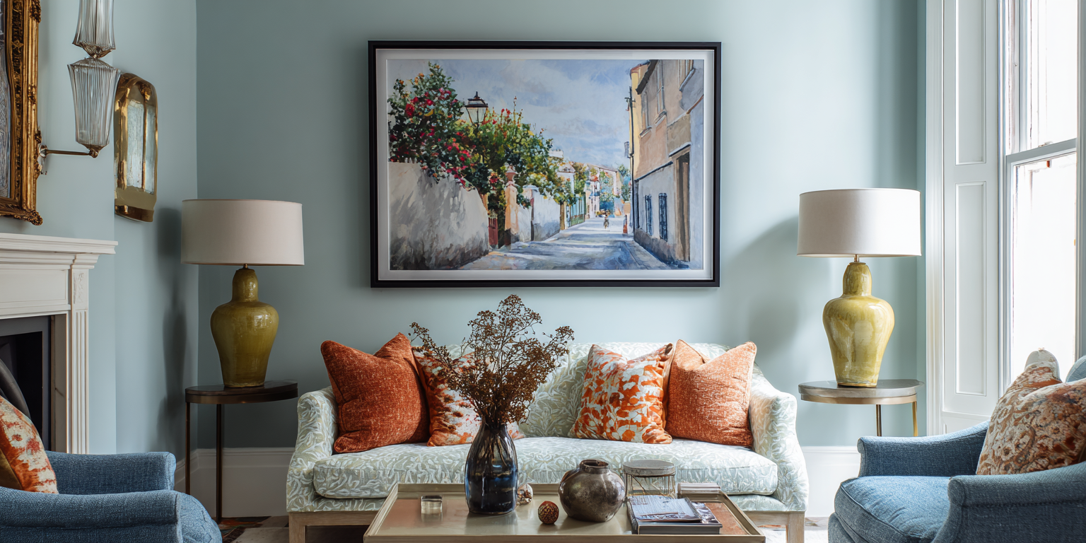
A single artwork or decorative object can drive an entire scheme. The trick is to look past the subject matter and study the colours:
- A landscape painting might offer a muted base tone with two bold accents.
- A vintage kilim rug may hold a dozen nuanced reds, greens and neutrals.
Another source of colour inspiration can come from the clothes you wear. Looking inside your wardrobe or drawers, is there a colour you’re drawn to time and time again across these items? How you dress yourself in colour can sometimes transfer well into how you dress your home as well.
These clothing, art and interiors items contain built‑in colour palettes. Place a paint chart next to them and then bring together the 3 or 4 colour chips that match the colours. See how they look together outside of the pattern, design or subject matter of the art.
Tip: Photograph your favourite piece (in natural daylight or as close to as possible) and use a digital colour‑picker tool such as https://coolors.co/ to extract its main hues. This creates a ready‑made palette to test in your space.
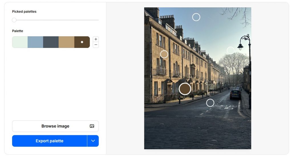
The Coolors website can extract palettes from your uploaded images, allowing you to play around with the various colours. Genius!
Borrow From Nature & YOUR Surroundings
Interior designers repeatedly return to nature as the richest palette source. Whether it’s a coastline, woodland walk or simply the changing view of plants from your kitchen window, the colours of nature are both timeless and grounding.
- In the South Downs landscapes around me, for example, chalky whites, muted greens, earthy browns and soft sky blues all translate beautifully into paint colours.
- Urban dwellers can look to seasonal change – spring blossom pinks, autumnal ochres, wintery blues and slate greys.
- The built environment can also provide inspiration – from painted shopfronts on your local high street to the colour combinations of old brickwork, roof tiles and shutters you pass on your commute.
Taking inspiration from nature blurs the boundaries between indoors and out – we’re forever hearing of interiors which ‘bring the outdoors inside’. This principle sits at the heart of biophilic design. Biophilic design is essentially about designing with nature in mind: maximising natural light and views of greenery, using shapes, patterns and textures found in nature, and drawing a colour palette from the landscape to create a sense of calm and restoration. It’s especially powerful when a room overlooks a garden because you’re reinforcing the real view with the design inside – creating a visual connection between the indoor and outdoor environment, which has been shown to reduce stress, improve mood and even boost productivity in that indoor space. For readers interested in learning more about this approach, watch this TedTalk by British biophilic designer Oliver Heath.
Tip: Next time you’re out walking or sitting by a view you love, stop and pick three or four colours you can see right there. Jot them down or photograph small sections close‑up rather than the whole scene. Back home, match these shades to paint chart chips or fabrics and you’ll have an instant, nature‑based palette to experiment with.
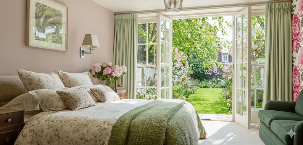
Inspired by the lush greenery and pink flowers of the garden, the decor of this bedroom visually connects us to the nature outside.
Take Cues from Hospitality Interiors
Hotels, restaurants, boutique cafés and spas are often masterclasses in colour and atmosphere. Designers in the hospitality world frequently use bold combinations, layered textures and lighting to create a mood or tell a story. Visiting a favourite bar or spa and noticing its palette can spark ideas for your own rooms: you might take a deep green from a hotel lounge and use it for joinery, or a soft plaster‑pink from a spa’s treatment room as inspiration for a bathroom.
Tip: When you’re in an inspiring interior, snap photos of colour combinations you love – not just single colours, but the way tones are layered with materials and lighting – and bring those references back to your mood board.
Make a Mini Mood Board
Combining your inspiration sources into a mood board – physical or digital – helps you capture all those colours and ideas in one place. A mood board is simply a visual collage or arrangement of swatches, photos, textures and notes. It gives you a quick, at‑a‑glance sense of how colours, materials and styles will work together before you commit. Include:
- A photo of your inspiration object or view.
- Paint swatches or digital colour chips.
- Fabric samples or images of furnishings.
- Any other finishes you already have or want in the room – wood, tiles, carpet etc.
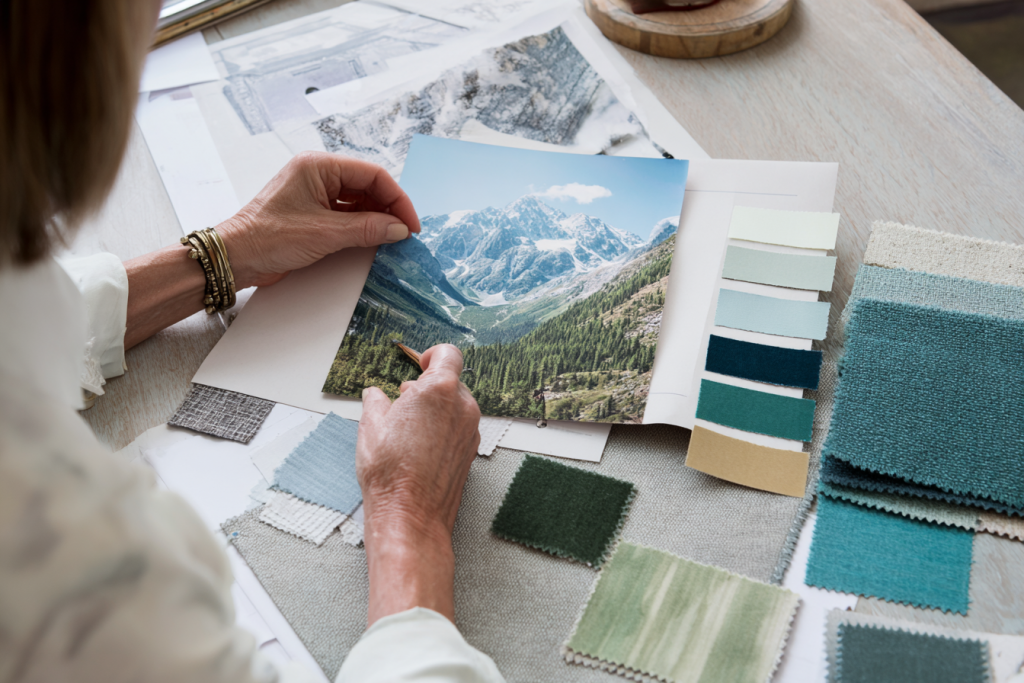
A mood board is a simple but effective way of testing colour options from an inspiration source, in this instance a favourite mountain landscape
Seeing them side by side will start revealing some interesting insights to help you further develop the scheme:
- Does the palette feel fresh, warm, dramatic or calm?
- Whether one colour is dominant over the others and may therefore be an accent or highlighting colour in a room.
- If there’s something missing – would a splash of a complementary colour or something bright bring some fun or energy to the scheme?
Seeing the colours and textures together will help you identify which colours could be the major players and form the basis of your wall colours, and which are the supporting cast. There is a helpful rule of thumb you might consider, which is the 60:30:10 ratio: 60% of your scheme is the main base colour, 30% is a complementary second colour, and 10% is an accent colour which is often bolder or contrasting and brings energy and drama. In practice, this could be 60% on your walls, 30% on the trim and doors and your window dressing, and 10% in the light shades, scatter cushions or other accessories. If you’d like four colours in your scheme, this rule still works if you use 2 analogous colours (ones which sit next to each other on the colour wheel) in equal proportions for one of those parts of the ratio. Or use the same colour but in different levels of saturation – such as Paint & Paper Library’s Leather used in different intensities in this bathroom. You could then have different colours for the 30% and 10% proportions.
Have fun with this exercise – and don’t forget the importance of colour psychology covered in my second blog post, to ensure that the colours you’re selecting support how you want to feel in the space, be that calmed, energised or other. If the colours you’re using have come from a loved item, view or artwork, chances are you’re already creating a scheme that fills you with joy or peace.
Conclusion
This three‑part series has moved from the fixed (your building), through the structured (colour theory and psychology), to the personal (external inspiration). By considering these steps, you can now start to create a palette that feels authentic, cohesive and deeply connected to both your home and your life. The most successful schemes don’t just look good – they tell a story about you and your surroundings, and they’re a joy to live with every day.
If you’d like more of a guiding expert hand to prepare a colour palette that truly captures your personal tastes, request my Colour Consultation.
Categories: ColourDecorating
jenny@kitedowncreative.com
07740 292 015
East Meon in Hampshire, GU32 1PD