Power of Pattern Part 1: The Psychology angle
What do you associate with someone who ‘loves pattern’? Do you think of them as eclectic? Bohemian? Extrovert? Laissez-faire? I expect there’s at least a small internal voice that says ‘ooh now, they are confident/a bit bonkers’ [delete as appropriate]. A glance through any interiors magazine will show that the calm, neutral decorative scheme is as popular as ever. We don’t see many showcases of rooms or homes that could be described as a ‘riot of pattern’. If we do they often contain the word ‘brave’!
But not everyone wants to live in a neutral showroom. Quite a lot of us would say we like, even love pattern – but we’re still hesitant about using lots of it in our homes. And I think that’s perfectly understandable – because pattern, far more so than colour, displays – or betrays – our personality. And adding personality to a home is still, sadly, seen as risky. Both from a resale perspective (how sad) and a ‘tell me I’m not about to ruin my home?’ concern.
This is the start of a 3 part Pattern blog series – in which my aim is to help build your understanding of, and then confidence, with pattern choices.
Building Confidence Through Understanding
Pattern isn’t simply about decoration; it’s about how our eyes and brains make sense of the world around us. When we recognise why certain patterns comfort us while others feel unsettling, we can start to use them with intention rather than hesitation. The most confident decorators aren’t brave; they’re attuned to how design interacts with emotion.
Some of you may be aware of Colour Theory – perhaps you recall seeing a wheel of the primary and secondary colours (if you’d like a reminder, here’s my blog post on exactly this subject!) But how many of us know anything about Pattern Theory? I’d say very few. Probably because it’s not really an area that has received much scientific attention. Neither has Pattern Psychology – whereas there is a decent body of work on how colour influences our mental wellbeing. I believe we can build our confidence with pattern in interiors when we understand our emotional and psychological connection to it. Meanwhile a few pattern rules and theory can help guide our decisions. So – let’s get a bit scientific.
Why the Eye Needs Somewhere to Land
Why does an absence or over-abundance of pattern affect us? Environmental psychologists Rachel and Stephen Kaplan found that people feel most comfortable in spaces which balance two key qualities: coherence & legibility versus complexity & mystery. Coherence gives us order – we need to make sense of what we’re seeing, to be able to read it confidently and easily so that we can assess our safety level. Complexity offers richness, and mystery promises the alluring enticement of discovery. Rooms that combine these traits feel both calming and engaging. Conversely, those that lack pattern can feel flat and lifeless and those that contain lots of pattern risk us feeling confused and disorientated. As the Kaplans put it, “humans seek environments that are both understandable and involving” (Environmental Preference: A Comparison of Four Domains of Predictors, 1989).
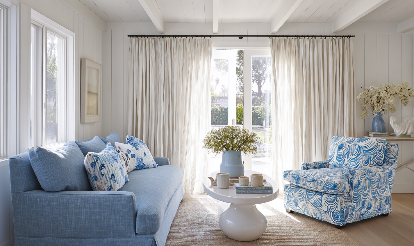
Pattern often provides exactly that sweet spot. A repeat, or recurring motif, creates recognisable structure – the coherence – while its placement, variation and rhythm supply complexity and a touch of mystery. When a room has no visual pattern or anchor, the eye continues to search for organisation and reward, and the space can feel uncomfortably sterile. Cognitive scientists describe this process as processing fluency: our brains experience pleasure when an image is easy to interpret but not completely predictable (Reber, Schwarz & Winkielman, Processing Fluency and Aesthetic Pleasure: Is Beauty in the Perceiver’s Processing Experience?, 2004). In interiors terms, that means a well-placed patterned element – a tiled hearth, a fabric headboard, or a decorative rug – gives the eye somewhere satisfying to land. It’s not decoration for its own sake; it’s how our visual system finds balance between calm and stimulation, between knowing and wondering.

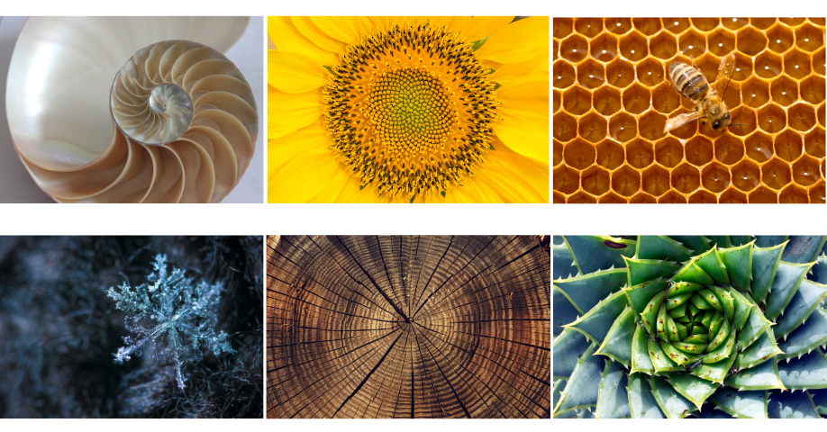
Patterns in nature – often shaped by the Fibonacci sequence or Golden Ratio – can be mesmerising and soothing.
Patterns in Nature: Our Biophilic Connection
We are instinctively drawn to natural patterns – from the branching of trees and veins of leaves to the spirals of shells and the ripples of water. Research into biophilic design and the neuropsychology of space confirms this response: organic patterns capture our attention without overwhelming us, evoking feelings of fascination and calm. And nature can create some spectacular patterns. Consider the snowflake – a masterclass in symmetry and fractals. Fractals repeat at smaller and smaller scales, offering visual richness that our brains find both engaging and soothing. As noted in the 2024 Neuropsychology of Space report by the American Society of Interior Designers, “Spaces that include fractal patterns, whether in architectural details or decor, invite closer inspection and promote a sense of relaxation and attentiveness.” When we bring these natural rhythms indoors – through wallpaper, textiles, or even the grain of timber – we create environments that resonate deeply with how we’re wired to see and feel.
Emotional Responses Beneath Awareness
Neuroscience shows that our bodies respond to visual cues even before we consciously interpret them. Research by Öhman et al. (2002) and Liddell et al. (2005) found that emotional processing can occur deep in the brain, through the amygdala and brainstem, milliseconds before we become aware of liking or disliking something. Even subtle shifts in visual rhythm or repetition can elicit physiological change – a rise in heart rate, a flicker of unease, or a sense of calm – without our conscious understanding. That’s why a room can feel ‘off’ without us knowing why: the pattern’s scale might be slightly jarring, its repeat irregular, or its contrast too stark for our subconscious comfort.
My design ethos is built on tuning into these instinctive reactions. I help clients explore their emotional connections to colour and pattern so we can design spaces that feel instinctively right – even when they can’t quite articulate why. When design acknowledges both the science and the senses, we create interiors that are not only beautiful but grounded in emotional wellbeing.

Striped windbreaks like these take me straight back to 1980s seaside holidays – these early patterns are often the ones that stay with us.
Cultural and Personal Connections
Patterns also carry cultural and emotional memory. Whether it’s a traditional damask, a mid-century geometric, or a simple gingham check, we respond not just to the form but to what it represents. Many of us have stored sensory memories of pattern: the floral tablecloth brought out for Sunday lunch, the striped deckchairs and windbreaks from childhood summers, or the tiled floor of a favourite café abroad. These associations shape our comfort levels and preferences more than we realise. Research published in the Journal of Environmental Psychology (Bower, Tucker & Enticott, 2019) reinforces this, showing that style, context, and familiarity all shape our emotional comfort. Environments that feel contextually appropriate or familiar evoke calmer physiological responses, while incongruous settings heighten arousal or tension. In design terms, motifs that feel natural to a space – botanical prints in country homes, geometric repeats in modern architecture – help occupants feel at ease because the brain perceives the environment as coherent and expected. Some patterns feel grounding because they echo familiarity and ‘belonging’; others energise us because they symbolise adventure or change. Our task as designers and homeowners is to heed those reactions – to notice which motifs make us feel at ease and which feel intrusive – and to use that awareness to craft spaces that reflect who we are and where we’ve been.
Your personal preferences
Kaplan’s coherence–mystery framework shows that we differ in how much visual complexity we enjoy before our comfort level dips.
Some people:
- Feel soothed by strong order (stripes, grids, checks).
- Feel energised by organic, irregular motifs (botanicals, freeform prints).
- Feel overwhelmed by high-density, small-scale repeats, or conversely, startled by large-scale bold patterns.
These tendencies are neither good nor bad – they’re personal thresholds.
Ask yourself:
- Do I prefer patterns I can quickly ‘read’ (coherence) or ones that invite a slower discovery (mystery)?
- Do I enjoy symmetry?
- Do I like strong contrast or softer, blended transitions?
In terms of biophilic patterns, if someone repeatedly gravitates toward leaf prints, wood grain, or meandering motifs, it may reflect a preference for patterns with moderate complexity and natural rhythm. Conversely, if they find these too “busy,” they may prefer graphic clarity.
In my client interactions, I help them to explore their pattern emotional history by reflecting on
- Patterns from childhood homes
- Holiday environments
- Architecture they feel at home in
- Fabrics or materials they’ve always been drawn to
These “internal archives” are powerful guides to their authentic preferences.
Final thoughts
There is no universal rulebook for pattern preferences – but there is a consistent psychology. We each have instinctive thresholds for complexity, rhythm, familiarity, and contrast. When we notice our emotional and physical reactions to pattern, understand which visual structures feel safe, energising, or overwhelming, and connect those signals to our own memories and contexts, we begin to design instinctively.
With these concepts in mind, we’ll move into Part Two of this series – exploring how to introduce pattern gently and within your own comfort levels.
Categories: Pattern
jenny@kitedowncreative.com
07740 292 015
East Meon in Hampshire, GU32 1PD