The Pattern questions everyone asks
When it comes to using pattern at home, a lot of people hesitate.
It’s not because they dislike pattern – far from it – but because it feels personal. Pattern doesn’t just bring colour; it reveals character. The shapes, rhythms, and motifs we’re drawn to often echo our personality more vividly than a simple paint choice ever could. That expressive quality is part of its magic – and part of why it can feel daunting when you’re unsure about personalising your space.
There’s also the oft-raised question of how to make different patterns work harmoniously. Many people assume there’s a strict set of design rules only professionals understand – a mysterious formula that dictates which patterns can and can’t sit together. That belief alone can stop them experimenting. In truth, designers do follow principles: once you understand these, pattern becomes something anyone can use confidently. But there are still wonderful results when these are ignored.
Over the years, I’ve heard many variations of the same few questions. Here are some of the most common concerns about pattern – and my brief take on each.
(And if you’d like to go deeper, I’ll soon be sharing a three-part Power of Pattern series, exploring how to choose, layer, and live comfortably with pattern in your home.)
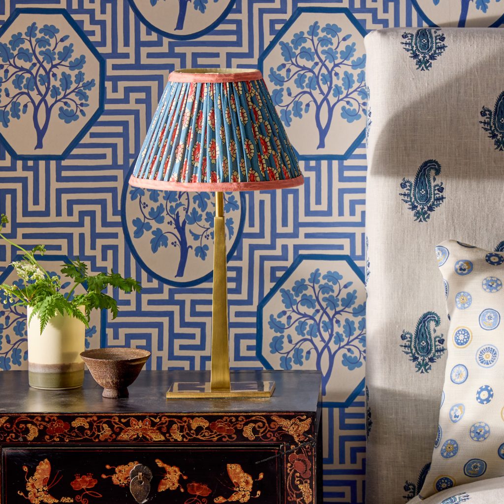
Despite the patterned wallpaper and headboard, Pooky’s Tiny Trafalgar rechargeable lamp, with GP & J Baker shade, adds interest rather than chaos through its shared colour palette.
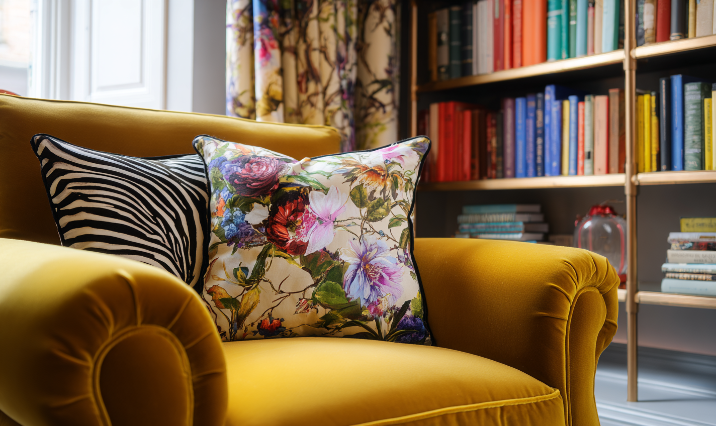
“I love pattern but I’m terrified of making my room look chaotic.”
You’re not alone. Pattern feels risky because it changes the visual rhythm of a space – and unlike paint, it’s often harder and costlier to undo.
Start with one pattern you absolutely love, because if that emotional connection is the basis for your choice then it’s unlikely you’ll regret, or tire of, it. Make this the hero piece in your design – be that on an upholstered seat, your curtains or if you’re feeling bold, the wallpaper. Then build around it using shared colours and simpler motifs. Multiple patterns can feels chaotic if nothing connects them. When tones or shapes repeat, the eye relaxes because it can find order.
“If my rug is patterned, should my curtains be plain or can they be patterned too?”
The short answer: yes, they can both be patterned – as long as they don’t compete for attention.
Balance the scale (large-scale on one, smaller on the other) and link them with a colour or motif. For example, a contemporary geometric rug with a stripe in the curtains can look refined and deliberate. A vintage Persian-style rug also has geometric elements which could work beautifully with similar shapes in a more contemporary curtain fabric.
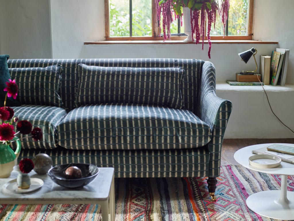
The recurring stripe motif on this traditional rug is picked up in the V&A Threads of India velvet on Sofa & Stuff’s Cromer sofa.
“I like pattern, but I need my bedroom to feel calm. Is that possible?”
Absolutely. Calm and pattern aren’t opposites.
The key is in the type of pattern and its tone. Pattern can add a quiet rhythm that’s deeply soothing, so consider gentle repeats that draw the eye softly rather than demand attention – patterns that immediately make sense rather than take up energy trying to find the repeat. And for a soothing bedroom, patterns with a hand-made nature can work better than sharp, digitally-printed definition – think Indian hand-block prints, painterly styles, or woven designs like a soft-edged Ikat.
“Can I use pattern if I have a small room or low ceilings, or will it shrink the space?”
A common misconception is that pattern will shrink a space.
Pattern can actually expand perceived dimensions when handled thoughtfully. Vertical motifs, stripes, and upward-leading shapes on the walls or full-length curtains can make a low ceiling feel taller.
A large-scale pattern in a small room can add energy and interest to it – if that is what you’d like. A shapely upholstered headboard in a small bedroom can add instant luxury when covered in a large colourful pattern, as Kit Kemp has proven so often. Conversely, a small-scale pattern used on the walls of a small room can subtly create a sense of space. The eye reads the repeat around the room, blurring boundaries and corners, giving the impression that the walls are receding rather than closing in.
The trick is proportion – not avoiding pattern, but matching its energy to the room’s size.
For more guidance on decorating smaller rooms, see my Small Space Living post.
“What’s the easiest way to start using pattern without a big commitment?”
Start small and low-risk: cushions, lampshades, a small ottoman or tie-on dining seat pads.
This helps you test what feels comfortable before committing to larger-scale decisions like wallpaper or upholstery.
Once you identify a pattern you truly love, use it as a foundation – repeating a colour or motif elsewhere to tie everything together.
Confidence grows with familiarity, so if you’re not sure give yourself a couple of weeks to see if you warm to it. Pattern doesn’t have to be an all-or-nothing choice.
“What colours should I pair with this patterned wallpaper/fabric so it all looks intentional?”
Begin by identifying the dominant colour, the secondary colour, and the background neutral in your chosen pattern.
Those three colours will guide the rest of the scheme.
Repeat the dominant tone sparingly to anchor the space; use the secondary hue in larger pieces such as curtains, sofa or bedding, and let the neutral provide balance.
If the palette still feels unsteady, look at undertones – warm versus cool – rather than hue alone. That’s where harmony lives.
Coming Soon: The Power of Pattern series
This post just skims the surface.
Over the coming weeks, I’ll be diving deeper into:
- Why we’re drawn to pattern and the emotions they evoke
- How to introduce pattern gently and test your comfort level
- How to use pattern to create layered interiors
If you’d like personal guidance now, my Pattern Power Consultation is a focused, one-to-one service that helps you understand your own unique connections to pattern – a useful exercise before committing to wallpaper, upholstery, or full decorative schemes.
Categories: DecoratingPattern
jenny@kitedowncreative.com
07740 292 015
East Meon in Hampshire, GU32 1PD