Confidence with Colour, Part One: The building
Choosing paint colours can for some people feel exciting, filling them with creative joy. But for others they may only feel overwhelmed – the horror of hundreds of swatches, conflicting advice, and the fear of making a mistake.
This is the first in a three-part series on how to select colours with confidence. We’ll start in this post with how your home itself can guide you on the colour selection journey: what it can suggest through its orientation, dimensions and architectural character. The second post will explore how a knowledge of colour theory and psychology can shape the formation of your palette, and the final post will look at the role of inspiration, turning to what you already connect with for direction. By the end of this short series I hope you’ll join me in embracing the selection of colour palettes.
So, onto our first lesson which is about what your building is telling you – through its light, architecture and character. The room you are decorating is one of a kind, unique – there is no other room that has this exact location, these exact dimensions, these same materials, these same light levels. But, whilst this might feel unnerving, there is some useful guidance you can apply to the room and its location.
Orientation & Light
The way natural light enters a room changes how colour behaves. This depends both on the timing of the light, and the direction from which it comes.
The quality and hue of light changes during the day – from subtly blue in the morning, neutral around midday and softly golden in the last few hours. So think about when you will be using the room – is this a bedroom in which you’re an early-bird who likes to wake to the sunrise, or is it a bathroom which tends to be used for relaxing evening soak?
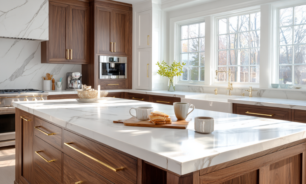
The bright morning light of this kitchen is amplified by the white walls and marble, but warmed by the walnut cabinetry and brass fittings.
If you’re tackling a morning room with lots of natural light, you might want to lean into the crisp morning light with a fresh blue palette – but avoid blues with a hint of purple or lilac, which risk looking icy in the morning and then murky for the rest of the day. Blues with a subtle green undertone work better, something a bit turquoise like Farrow & Ball’s Blue Ground.
If you’d prefer to warm up your morning room, turn to colours that counter the blue light – soft yellows, blush pinks, earthy-based neutrals like Little Greene’s popular Silent White, or yellow-based greens such as Portland Stone.
Where your room is flooded with warm evening light, you might want to embrace that to create a room that positively glows – pinks, corals, or ochres will do just that. If you’d prefer a light neutral or a typically cool colour (blue, green, grey) in an evening room, I’d still suggest a warm undertone so that the room is still welcoming throughout the day. Teal looks fresh during the day and luxurious in golden light.
Next to consider is the orientation, which builds on this concept of the light spectrum throughout the day. I’m based in the northern hemisphere, so this guidance can be reversed for readers in the southern hemisphere.
The choice of vibrant Vardo creates an indulgent and stimulating north-facing dining room, image courtesy of Farrow & Ball.
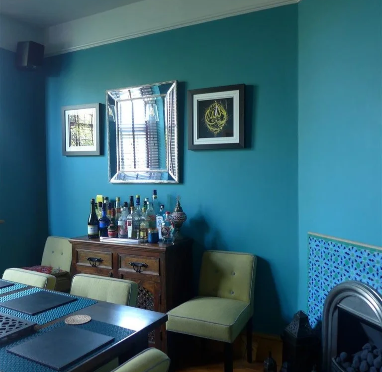
North-facing rooms receive a steady level of fairly cool light throughout the day. It’s for this reason artists like a north-facing room. This light feels muted, which makes pale colours look flat, or as some say, a bit ‘meh’. Softer, yellow-based neutrals or warm, earthy tones help bring comfort to these spaces. Stronger, darker shades can also work well, creating a cocooning feel. Deep berry colours, chocolatey browns and luxurious teals can turn an unloved north-facing room into something bold, sumptuous and memorable, and these colours glow under the artificial light you’ll use in the evening here. Whatever you do, don’t paint a north room white under the assumption it will look brighter. It won’t – it will look sad.
South-facing rooms are bathed in bright light for much of the day. You have more choice in these rooms. Cool blues, greens and greys sing in these rooms, creating a fresh and uplifting mood. If you like pastels, they work well in these rooms, especially mint greens or aqua blues, as they maintain their brightness without becoming icy or washed out (pastel pinks or pale corals would also work in the cool light of a north or east facing room). Saturated brights and deep inky blues work well in south-facing rooms, especially with contrasting pale or white ceilings and trims.
East-facing rooms capture crisp morning light but levels become muted and softer after noon. Fresh, uplifting hues like soft yellows, delicate greens or warmer pastels often work best, as described in the morning light section.
West-facing rooms have fairly flat levels of light for most of the day but can then positively glow in the evening – warmer tones capitalise on that golden light, while neutrals become warmer as the day progresses. If you want drama, go for the boldly saturated warms such as Little Greene’s Nether Red. The low sloped ceiling and walls of my west-facing ensuite, painted in Setting Plaster, becomes irresistible for an evening bath when the golden-hour sun pours in. And in the dull early morning its gentle pink provides a soothing start to the day.
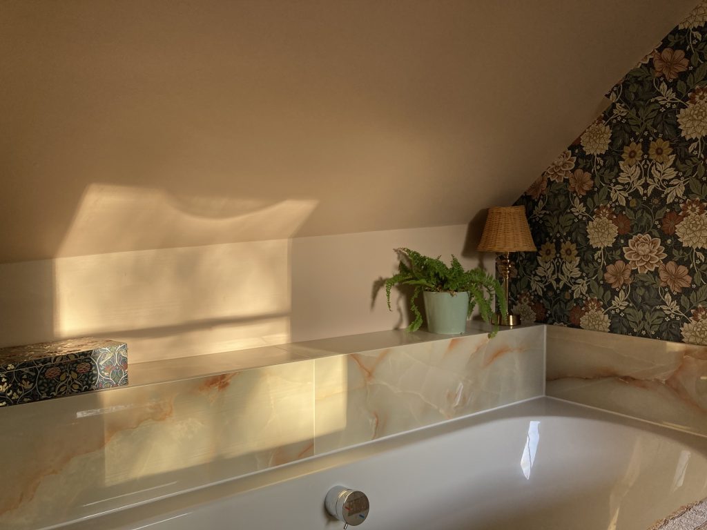
Evening sunlight brings a golden glow to the pink tones of Farrow & Ball’s Setting Plaster in my ensuite bathroom.
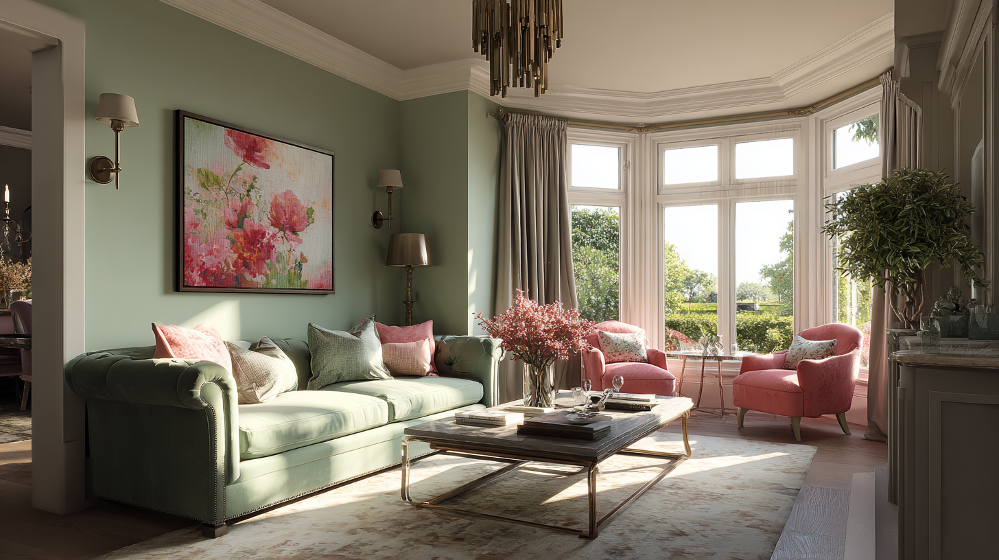
If your room is dual aspect, think again about which part of the day you use it most and focus on the aspect illuminating it at that time. The dual aspect with the greatest impact on paint colour is east-west, due to the change from blue to golden light throughout the day. Embrace the drama – a saturated warm blue would work well, as would warm neutrals, blush pinks and soft green- or earthy-based greys.
A brief sidebar on working from home. With a lot of us working some or a lot of the time in a room at home, this is a room to pay attention to. Ideally I’d say use an east- or south-facing room, because some morning light or sunshine will make this a much more pleasant space to start the working day.
Tip 1: Observe a room at several times of day. Note how shadows fall and how natural light shifts. Stick multiple large (A4 at least) swatches of your possible paint colour on every wall. You may find a colour looks perfect in morning light but dull at dusk.
Tip 2: Place two large swatches of a colour together in a corner to see how the colour reacts bouncing off itself. This is useful for a single colour, but essential if you’re planning a feature wall in a different colour.
Now lets look at the room itself more closely, at the Architecture & Period Features
Dimensions
Colour can both enhance and alter the perceived dimensions of a room, and thus your experience in it.
If you have a large room, lighter and less saturated colours can maximise the sense of space. If it’s filled with light, you might want to enhance that and keep the walls and ceilings light and neutral to celebrate the light as it moves across them throughout the day. If it’s not filled with light, then celebrate colour instead, with greater levels of saturation. And if you want a large room to feel smaller, bring in contrasts of colour: a deeply coloured feature wall that visually advances towards you, or contrasting skirting, coving and trim (be they lighter or darker than the walls) avoids the sense of limitless space felt when everything is the same colour.

The pale grey walls of this light-flooded living and dining room enhance the sense of space
A smaller room will benefit from a single colour drench – on walls, ceiling and trim – so that your eye does not easily see the boundaries and feels larger. The fewer the colours the greater the effect of space in these rooms. Strong and saturated colours work well in small rooms, where the colours double up on themselves in the corners. I’d suggest focusing on making small rooms cosy and embracing – even if you want them to be relaxing spaces, as we’ll discuss in the second post of this series.
Fixed Elements
Your home’s architectural character could also guide your choices. Beamed ceilings, encaustic floor tiles, exposed brickwork or stone fireplaces all carry their own tones and textures. Rather than competing with these, paint colour should enhance them – so bring them into the colour palette debate right from the start. And try not to see them as limitations – rather, they can be the starting points or inspiration. Look carefully at that stone fireplace and see how many subtle colours start revealing themselves in the veins etc. Or consider that if you are lucky to have something special like gloriously rich parquet flooring, perhaps that should have most of the attention and you can keep the walls pale and unobtrusive.
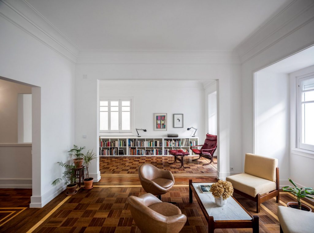
Why distract from the glorious parquet in this 1930s property by Lisbon-based architects Aboim Inglez Arquitectos?
The architectural period of your home can also guide colour choices. Without being a slave to history, you might want to look to the typical colour palettes associated with the period in which your home was built. I have written in more detail about this in my post on Heritage Colour Palettes. Contemporary homes can often take crisper and brighter colours than might suit, for example, an 1800s cottage. But these rules aren’t hard and fast. What is helpful is that many of the paint brands have developed specific heritage colour palettes, or comment on which colours might suit contemporary homes or schemes.
Tip 3: Walk through your room(s) with a notebook, jotting down orientation, features to keep or disguise, and existing materials. This becomes the framework for your colour scheme development.
Starting with the building itself is a logical first step for your colour scheme. In the next post we’ll look at how colour theory and psychology can apply an additional lens through which to focus.
Categories: ColourDecorating
jenny@kitedowncreative.com
07740 292 015
East Meon in Hampshire, GU32 1PD