Confidence with Colour, Part Two: Theory & Psychology
In the first post of this series, we looked at how the building itself – its orientation, natural light and architecture – can provide guidance for your colour choices. Starting with the room specifics grounds your scheme in the reality of your home. But once you’ve considered what the building is telling you, there’s another lens to apply: colour theory and psychology. Together, these help you create palettes that not only look cohesive but also make sure the room supports the mood and ambience you need from it.
The Colour Wheel in Practice
The colour wheel is a simple but powerful tool. It helps explain why some combinations feel balanced and harmonious, while others create energy or tension.
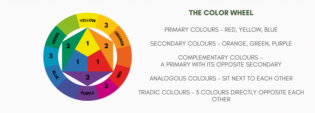
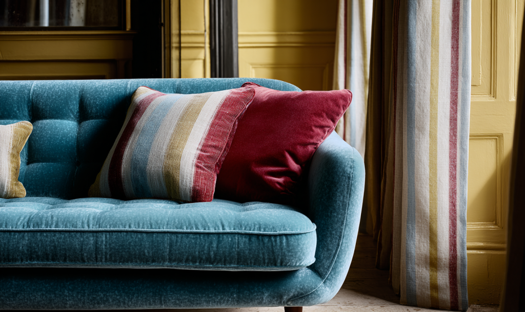
- Complementary colours sit opposite each other (blue and orange, red and green, yellow and purple). Together they create vibrancy and contrast. There’s a cool colour paired with a warm one. These combinations will be everywhere when you start looking – warm terracotta roof tiles against a vivid blue sky, a soft pink rose nestled in its green leaves.
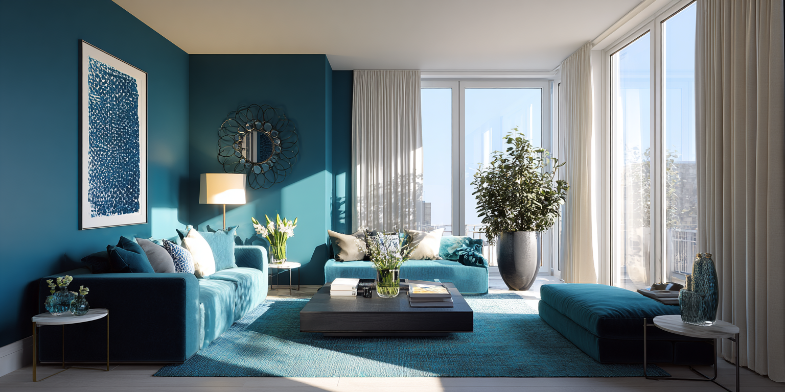
- Analogous colours sit side by side (blue, teal, green). These bring calm and unity. Think of a handful of collected sea-glass from a beach.
- Monochrome schemes use a single colour in different tints, from pale through to deep. This creates sophistication and flow. It can be serene in pale colours or dramatic in richer ones.
- Triadic palettes combine three colours evenly spaced around the wheel, such as blues, red and yellows. Used carefully, they bring energy and playfulness.
Tip: Create a small test board with three swatches from different parts of the wheel and place them side by side. Notice how you respond to these combinations – are they lively, calm, or dramatic.
Three different complementary colour schemes showing how they can bring both drama and calm.
Tonal Variation and Flow
Have you noticed how many paint brands now provide their colour in different levels of saturation, suggesting combinations of them be used across ceiling, walls and trim? Using pale, mid and dark versions of the same colour is one of the simplest ways to build an elegant colour scheme for a room and cohesion across your home. The latter allows each room to have its own character while maintaining a thread of consistency.
- For example, a pale aqua in the hallway, a mid teal in the sitting room, and a deep cobalt in the study. Each space feels distinct, but together they tell a story.
- Tonal layering within a single room works particularly well when there is painted joinery, such as built-in book shelves, or in your kitchen.
Tip: If you want to create a feature wall with a different shade of your colour, a darker shade will advance towards you and visually foreshorten the room, whereas a paler tint will recede away and lengthen the room. This can be a useful trick in rooms with difficult dimensions.
Quick sidebar: you might be wondering what’s the difference between a tint, a shade, and a tone. Good question. A tint is a colour to which white has been added to lighten it. Peach is a tint of orange. A tone is a colour to which grey has been added to desaturate it or create subtlety. Sage green is a tone of green. And a shade is a colour to which black has been added to darken or enrich it – navy blue being an example. Whilst we’re here, a hue is the pure colour itself, such as red or blue.
Contrast and Balance
Colour isn’t only about hue – it’s about contrast. The balance between light and dark, cool and warm, these shape how a space feels.
- Contrast for drama: Deeply coloured walls with crisp white trim, or a bold feature wall, create energy and a striking effect.
- Harmony for calm: Tone-on-tone schemes, where walls, ceilings and trims are all close in depth, feel more restful and seamless. Layered neutrals are an elegant version of this. See Kelly Hoppen’s work for a masterclass in that.
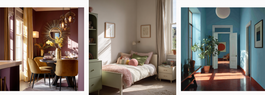
The similar shades, or softness, of the blue, yellow and red in this triadic scheme show how harmoniously they work together.
Colour Psychology
Colour has long been known to elicit an emotional and behavioural response. Karen Haller, author of The Little Book of Colour, explains that the psychology of colour is about how colours work together to influence behaviour. She writes “We see colour with our eyes, but the real magic happens in the brain. Once colour is processed, it triggers an emotional and physiological response, altering how we feel and behave. This is why understanding the role of colour psychology in interior design is so powerful.”
- Blues and greens are calming, restorative, often linked to nature and balance. Good choices for bedrooms and bathrooms.
- Yellows and orange are sociable, uplifting, energising. Perfect for kitchens or dining spaces.
- Neutrals: grounding, versatile, restful. A reliable backdrop in any room, but especially good for busy family spaces.
- Reds and pinks: stimulating, enveloping, romantic. Depending on the tone, they can create warmth in living spaces or intimacy in dining rooms.
By aligning colour psychology with room function, you create spaces that support how you live. A calming green study aids focus for some, whereas others may seek creative stimulation and energy from a triadic scheme. Sophie Robinson, so recognised for her colourful schemes, tells how she originally painted her study in soothing (sensible?) pales – only to feel totally flat in it. Once she’d followed her instincts and redecorated it in vibrant colours and pattern, her creativity soared.
Our response to colour can be from our own past experiences or from cultural messages. In my design process, and particularly the Colour Consultation I offer, I encourage clients to recall favourite scenes and moments from their life and consider the colours from those.
Tip: Forget about colour trends or what you’re seeing on a paint chart. Think about the colours you’re instinctively drawn to, and then how they make you feel. Consider how these can be incorporated into your colour scheme.
Conclusion
In Part One I explained how the building can provide a useful structure for scheme choices. Colour theory gives you the science. And psychology makes it personal. By layering these together, you can move beyond trial and error into creating schemes that are both cohesive and emotionally resonant.
In the final post of this series, we’ll look at the third layer: inspiration. From the landscapes outside your window to the artwork and objects you love most, these sources can become the anchor points for your palette – the step that makes a scheme uniquely yours.
Categories: ColourDecorating
jenny@kitedowncreative.com
07740 292 015
East Meon in Hampshire, GU32 1PD